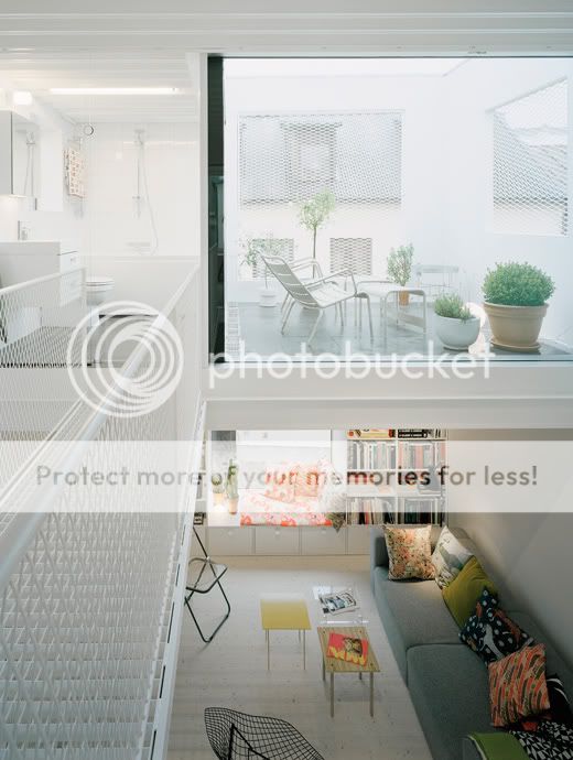

I can't decide if I like this Swedish townhouse or if it's just too brutal and unsympathetic to the traditional neighbouring houses. From some angles it seems to fit in but in other photos it seems so loud.
But this is what the architect, Elding Oscarson, says: "The building relates to the surroundings in scale, proportion and in the way it adds to the established rhythm of low and tall buildings along the street." [source]
The site was empty for over 50 years, so this new building has definitely added value to the street.

Rather than copying the style of the traditional houses, this townhouse reflects the design of today, and in a few decades people will look at it and admire the layers of history in the street. This is seen in London a lot: there are streets with buildings spanning several centuries, and then a modern building will spring up. Why shouldn't we juxtapose ultra-modern with traditional? They did this in the 19th century when they built next to 17th century buildings.

I'm attracted to the simple lines and the minimalist windows, especially the opening in the roof that has created a perfect roof terrace (photo above).


This final image is the most exciting to me as it shows the different options that the architects considered before settling on the final form.

[All images: Elding Oscarson. Found via: Dezeen.]


12 comments:
love the interior, gorgeous, clean and light, not sure abt the exterior though, im torn like you....
FABULOUS !
I would live in it! :) I agree that the white is a bit stark compared to the other buildings, but within itself I think it's beautiful!
i love it. i love modern buildings in older neighborhoods - i think it brings an attention to the older buildings around the modern one, as the differences are so dramatic. and the beauty of modern design... how could one not want to immediately move in?
the house is ok. I would rather live in one of the cute neighbor houses. BUT I love the sofa and all of the fun pillows
I like boxy things, but that house is too boxy for me.
how interesting...i love the modern, clean lines of the townhouse but i'm not sure that i like how it fits in with the rest of the neighborhood. and i usually like the mix of modern and old. i'm torn!
i love the house the interior and exterior so crisp and clean and sharp. i also love the houses next door. traditional, quaint and cute. i dont like the two styles next to each other though. the opposing styles is too much for me. sometimes contemporary architecture can work really well with the old but for me this doesnt...
I like the openness and airiness of the interior but it is quite a shock to see it next to those quaint, comfy houses.
iamemmamusic.blogspot.com
i seriously love the house and it makes me think of all those homes i've seen in many Japanese design magazines. it's simple, spacious and seems like a nice place to live and lounge. however, i don't think the house belongs in that particular neighbordhood. the other homes are old and traditional and charming in their own right. the white house looks out of place.
At first I didn't like how it stuck out like a sore thumb but then i thought why not?? We can always have the best of both worlds!
clothedmuch.blogspot.com
Luv your blog, Rebecca.
I like the house and how clean and airy it is - but it is a little too open for my taste. I tend to like a little privacy in the evenings when I am slumming in my jammies and especially if I'm in the bathroom! The rooftop deck is divine though.
Post a Comment