Showing posts with label Exhibitions. Show all posts

John Pawson - Design Museum

13 Jan 2011

Photobucket

Today, I visited John Pawson - Plain Spaces at the Design Museum. Pawson was one of the first architects that my tutor introduced me to when I started studying Interior & Spatial Design, and I would regularly look through his books and projects throughout my course. His style is simple, calm and timeless.

At the centre of the exhibition is 1:1 scale architectural installation. The photo above is the view when you reach the top of the stairs and enter the gallery space. There is a thin layer of fabric mesh between us and the room which creates a misty, dream-like feeling. People were walking up to the mesh to see what it was. There is a way into the room later on in the exhibition, and this is the view from the other side:

Photobucket

Photobucket

Pawson is well-known for his 'floating' elements and it was a joy to sit on one of his benches. The timber is soft and warm to the touch, and the 'weightlessness' is stunning, and quite remarkable.

Photobucket

The photo below is the same view as in the first image, but this time standing in front of the mesh screen.

Photobucket

From listening to an interview, I learnt about his design ethos, which is centred around creating an experience for the visitor. He said that when he was about 12 years old, he walked into a building which made him feel a certain way, and he knew that he wanted to one day design buildings that trigger an emotional response or affect the visitor's mood.

Photobucket

He starts a project by sketching and then moves onto making physical models. He said that the models are left out on the desk the whole time, and by looking at them each day they trigger new ideas. The models are photographed to create life-like views which can be developed further. Below are photos I took inside models of two different Chapels.

Photobucket

They were quite small, but so detailed and realistic!!

Photobucket

For Pawson, each project needs to have one big idea behind it, so it has some meaning. The materials usually have meaning and a relationship with the surrounding context. The following part of the exhibition was my favourite, as projects were displayed with real samples of materials. You can read about the building and simultaneously feel the materials. When looking at projects in books, I often find it hard to imagine what the materials are really like. In the book you just see colours, but in real life you can feel the texture, warmth/coolness, see reflections...

Photobucket

Sackler Crossing, Kew Botanical Gardens

Black Granite - deck
Bronze - balustrade

There was a video of this walkway and the way the bronze reflects in the water is stunning. I'm planning to visit when the weather warms up!

Photobucket

Baron House

Falun Black Timber - external shutters, entrance cladding
Corrugated Zinc - roof

Photobucket

Cricket Pavillion, Oxford

Oak - cladding
Marble - roof

Photobucket

I enjoyed this exhibition immensely and found it to be really inspiring for me, on a personal level. I can relate to John Pawson's way of working with a physical model, and intend to continue to work in this way in the future (despite often feeling pressure to design in CAD). I learnt that materials are so important and need to complement the enviroment as well as each other. For a simple design to be successful, the material pallett needs to work perfectly. A simple design can't be cluttered with lots of materials; fewer materials create a calmer, more cohesive environment.

Resources:
- John Pawson
- Plain Spaces Blog

*all photos taken by me.

Over the weekend

21 Jun 2010

royal academy - summer show 2010

On Saturday I visited the Royal Academy Summer Exhibition. It's in it's 242nd year! (Couldn't believe it when I read it!) It seemed better that the exhibition last year, for some reason. The rooms are packed from floor to ceiling with paintings - it's quite overwhelming! It's exciting to see how many orange stickers each of the paintings have, which indicates how many have been sold. One picture had a good few rows of stickers and when I looked it up in the book, I found it was by Tracey Emin - no surprise then! Some people buy a piece from the Summer Exhibition each year. Maybe one day, when I'm a proper grown up with some money, I'll do this... I think it would be a lovely way to collect art.

My favourite room was the architecture. It was quite incredible seeing all the models and sketches lined up. This pieces were arranged by David Chipperfield. Sadly photos weren't allowed, but I made notes in the book next to the pieces I liked and was able to Google the architects to find out more.

royal academy - summer show 2010

[Photos 1 & 2 from The Telegraph]

Then I hopped on a tube and visited the BA Summer Show at my college - Chelsea. My favourite section was the textiles. The students each had a printed postcard of their work and I collected my favourite ones, which can be seen below. I think I can relate to design more than art. A lot of the fine art on display was conceptual art/installation. I can appreciate this kind of work when it's done well, but to be honest it's just overload and I left feeling quite disappointed. It must be so hard for the fine art students, though, as there's the constant feeling that the work has to be original. It was interesting to see the BA Interior & Spatial Design work, although I didn't always understand what I was looking at. It would have been great if the students were there to talk about their projects.

chelsea textileschelsea textiles

I found this top in a Charity Shop for £1.49. I was immediately attracted to the colour, although the shape wasn't quite right. So I gathered the shoulders and I really like it now. I've used safety pins for now, but need to get round to adding some stitches.

coral top

On Sunday, I travelled to Brighton for the day with my husband. It was a lovely, relaxing day. I took all film photos and haven't finished the roll yet, so I don't have anything to show for Sunday. It's quite an odd feeling taking photos on film, as it's a gamble whether the pictures will come out. Fingers crossed!

Birthday week photos

7 Jun 2010

saatchi gallery richard wilson 20 50 - 1

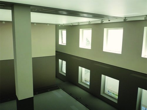
On my birthday, I travelled into London with my mum to visit the Saatchi Gallery. Surprisingly, neither of us had visited before. Richard Wilson's 20:50 installation was, by far, the best exhibit. It was truly breathtaking. The room appears to have a polished floor, perfectly reflecting the ceiling, but it is in fact flooded in oil. It was such a disorientating experience, and if you couldn't smell the oil, then I don't think you'd believe it!

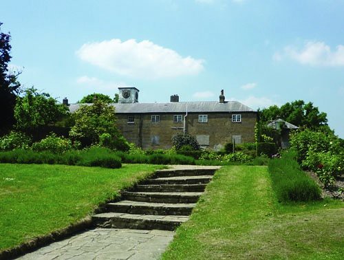
beckenham place park abandoned stable block

A couple of days later, we visited a local park that I can't believe I hadn't been to before! The photo above is of the abandoned stable block which I desperately wanted to explore. My mum remembers the building being used as a nature centre for children about 25 years ago.

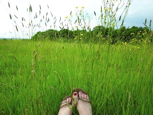
beckenham place park field

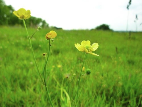
The weather was beautiful so I went back to the park with my husband on Saturday. We ended up walking for miles and finally ended up in a field. It was lovely to sit on the grass and breathe fresh air. Over the years I've become much more of a country person. This park is certainly not countryside, as it's only 8 miles out of London, but it is very peaceful. I'm just not that keen on the stress of the city anymore.

beckenham place park

PS. Something really strange is happening with photos on Blogger. These photos just wouldn't upload from Photobucket, and when I tried with Flickr, the colours were too saturated. I used the Flickr photo editing tool to tone the colours a bit, but they still look a tad strange. Has anyone else had this experience?

Henry Moore at Tate Britain

4 May 2010

henry moore
Exhibition at Tate Britain

My mum and I went to see the Henry Moore exhibition at Tate Britain last weekend. When I was a child, I used to enjoy leafing through her Henry Moore books and old exhibition catalogues from the '70s, so it was quite nice to visit this together.

henry moore
Mother and Child sketches and sculpture

The first part of the exhibition focused on the Mother and Child theme that Moore continued to explore throughout his life. Over the years, the form of the figures became more abstract. I was desperate to run my hand around some of curves in the stone, but sadly this wasn't permitted which was a shame. (My mum was worried I'd set off an alarm as she thought I was getting too close!)

henry moore
Carved stone sculpture

A lot of his early work is carved in stone, and this is what Moore said of his use of Horton stone: "...in the early part of my career I made a point of using native mateials because I thought that, being English, I should understand our stones. They were cheaper, and I could go round to a stonemason and buy random pieces. I tried to use English stones that hadn't been used before in sculpture." (source: exhibition booklet)

henry moore
Ideas for war drawings

We decided to listen to the audio guide to get a full understanding of the exhibition, but we were quite disappointed by it. We spent a lot of time walking round in circles looking for the numbered artworks and the guide mainly focused on the politcal context of the art, rather than on the actual pieces. Context is vital when appreciating art, but I would have liked to find out more about his way of working.

Nevertheless, I was fascinated to learn that Moore was one of the country's official war artists. His job was to draw the people sheltering in the underground platforms, but he felt it was disrespectful to sketch them in situ. Instead he took notes and based his drawings on newspaper photographs.

henry moore
War drawings

He got the effect in the image above on the right by using wax crayon to define the people and washing a layer of dark paint over the top. The way the wax repels the paint emphasises their ragged clothes and worn skin. It was really moving to see these pictures.

henry moore
Carved elm wood sculpture

The last room focused on sculptures that Moore carved from elm wood. The image above doesn't give any sense of scale, but they were enormous -- several metres in length and a couple of metres across. Incredibly, they are carved from a single piece of wood. Due to the size of the tree truncks, Elm has a very large grain and is therefore suited to making large pieces of sculpture. As Moore said, you can't make a small sculpture from Elm as the grain would end up in the wrong place. Although he couldn't control where the grain markings went, the lines wrap around the curves of the sculpture in such a soft, human way. These sculptures were my favourite out of the whole exhibition. There was a real softness to them. I leant that Moore was able to carve more openings in the elm than in the stone, since is was a lot softer, and the voids became equally important as the solid parts.

(* Image credits: 1, 2, 3, 4, 5, 6, 7, 8. Since photography wasn't allowed, I found images of similar artworks online. Not all of these pieces were exhibited at the Tate).

Ron Arad

18 Mar 2010


[All exhibition photos by me]

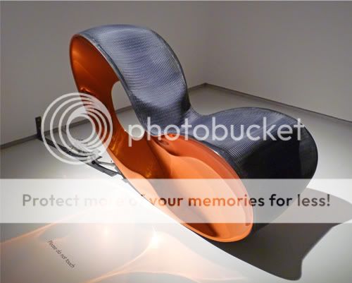
I visited the Ron Arad exhibition at the Barbican on Monday. The exhibition is called Restless and there is an underlying theme of movement. Chairs have mechanisms causing them to spontaneously rock back and forth, and there are bouncing and sliding bookcases. The pieces of sculpture are really beautiful and he used so many exciting materials: wicker covered in resin, steel, woven mesh, found objects. It was so frustrating not being allowed to touch anything!

A bit of background about Ron Arad: He was born in Tel Aviv, he moved to London in the 1970s to study architecture and made his name in the early 1980s as a self-taught designer-maker of sculptural furniture. He now works across both design and architecture.


Although we weren't allowed to test these particular chairs, some looked really comfortable and I can see that he's studied the contours of human body. But other pieces were clearly just experimental art and would have been quite painful to perch on!

I think the following chair is so elegant. I love the way the seat flows into a carpet...


In the piece below, the end of the rails lift up then lower causing the round bookcase to slide across the rails. I was expecting it to roll the whole length like a giant wheel, but it only moves a small distance. It's still impressive though.


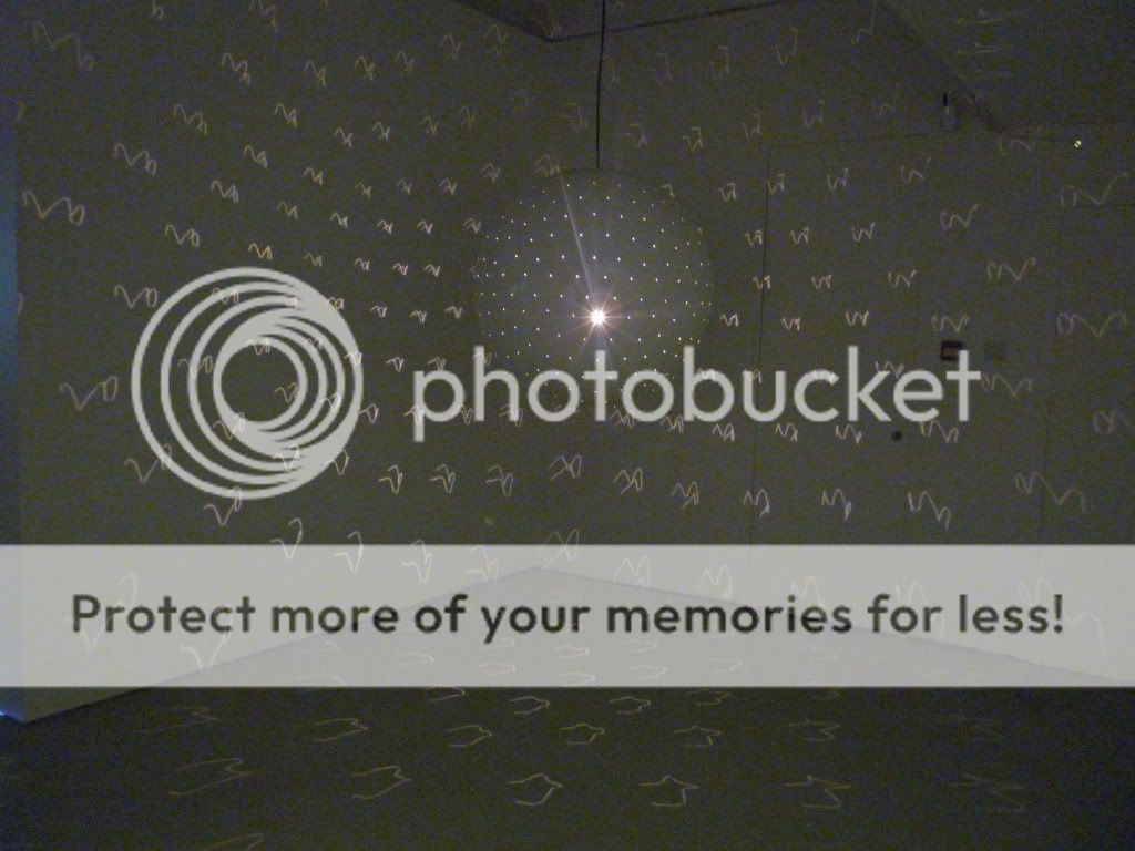
This is a light sculpture that projects squiggly lines across every surface of the room. One of my friends lightly pushed the dome and and it caused the squiggles to go crazy and move around the room. It looked like the walls were moving and felt quite disorientating!


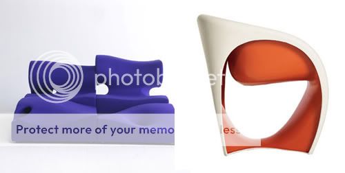
At the end of the exhibition there is an area where visitors are able to test out some pieces of furniture, which was fun. Some of the pieces looked really funky but were really uncomfortable or dangerous to sit on. But maybe we were swinging on the rocking chairs too violently! Here are a couple of my favourites:


[Image from Bonluxat]

Chris Ofili at Tate Britain

5 Feb 2010


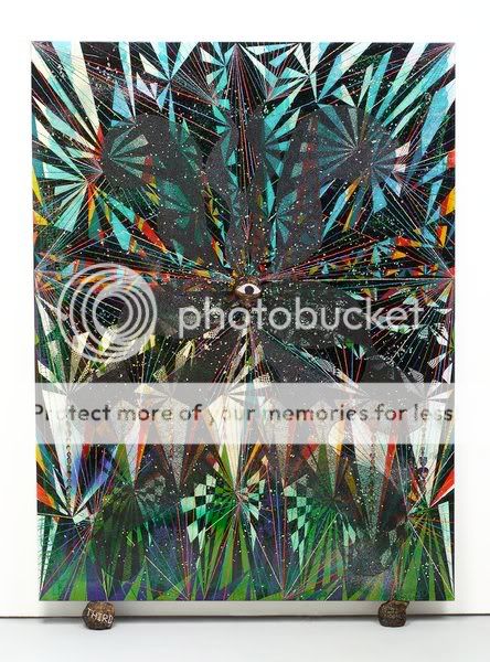
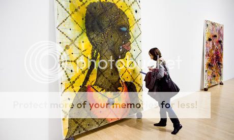
I saw the Chris Ofili exhibition at Tate Britain on Wednesday. I didn't know anything about this artist, so when I entered the first room and noticed elephant dung on his paintings I was slightly shocked! But I was immediately blown away by the stunning colours. When you go up close, you can see layer upon layer of dots in vibrant colours. Close up shot of texture:


I've since learnt that Chris Ofili started using elephant dung in his paintings when he was in Zimbabwe. He says, "[Using dungballs is] a way of raising the paintings up from the ground and giving them a feeling that they've come from the earth rather than simply being hung on a wall." [Quote from exhibition leaflet]. When I read this, it made much more sense to me.


It's a large exhibition with 7 rooms in total and my favourite was the Upper Room which takes you on an extraordinary sensory experience. The paintings are displayed in a specially constructed vault designed in collaboration with architect David Adjaye.

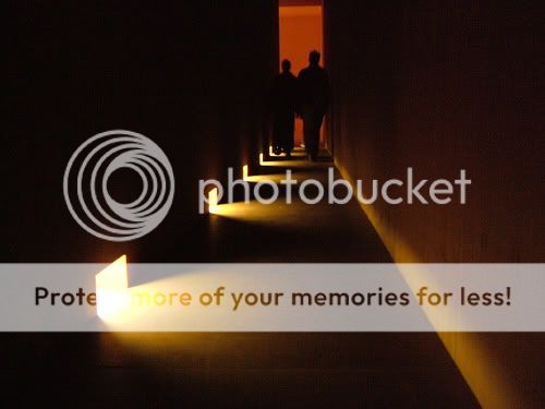
To enter the vault you first pass through a long corridor which is completely dark apart from some illuminated openings along the floor. It's quite scary walking in the dark but the lights entice you further into the space.


When I reached the end of the corridor and turned the corner, I was amazed that the entire space was clad in beautiful timber - floor, walls and ceiling. The texture was lovely, as it felt smooth but also quite raw.


The lighting is exquisite. Each painting is illuminated by a single directional light from above, and it is this light that shines through the openings behind the paintings into the corridor. The paintings literally glow against the dark timber backdrop, and the light is reflected in a pool at the foot of each canvas. The conditions in the timber vault really bring out the richness of the paintings.


I feel I really learnt something at this exhibition, and not only about a new artist, but also about the design of the exhibition. I should visit Tate Britain more often as it is directly opposite my college and I have free access as a student!

[Image sources: 1, 2, 3, 4, 5, 6, 7]

Less and More

9 Dec 2009

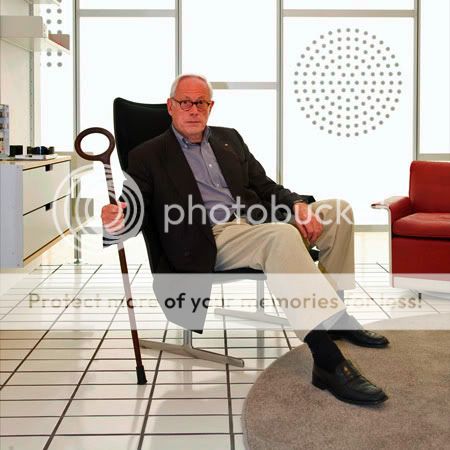
"Question everything generally thought to be obvious" - Dieter Rams


Photos taken at Less and More, Design Museum, London: Alphanumeric on Flickr

When I visited the Design Museum last week, I had a look at Less and More. This exhibition celebrates the work of Dieter Rams whose design ethos influenced Braun's range for over 40 years.

I really enjoyed reading Dieter Rams' 10 principles of good design. I can identify with each point; they are all so true. I think my favourite is the last one as I always feel the simplest designs are the most powerful. To produce an uncomplicated and minimal design is not easy.


Good design is innovative.
Good design makes a product useful.
Good design is aesthetic.
Good design makes a product understandable.
Good design is unobtrusive.
Good design is honest.
Good design is long-lasting.
Good design is thorough down to the last detail.
Good design is environmentally friendly.
Good design is as little design as possible.

Form Matters

4 Dec 2009

I visited the Design Museum yesterday and saw David Chipperfield’s exhibition, Form Matters. I can’t tell you how much I love David Chipperfield. He was the first architect that my tutor introduced me to last year and from the moment I saw his work I realised I’d seen pure perfection. I admire the way he creates internal spaces within his buildings: he creates light and bright interiors that aren’t sterile in the slightest. He creates glimpses and selects views that guide your sight. I listened to a podcast and he sums up his architectural aesthetic as “modest, with simple concepts”. His style is very elegant and restrained. His designs are stunningly beautiful, yet understated.


Some of my favourite interior views. Source: David Chipperfield

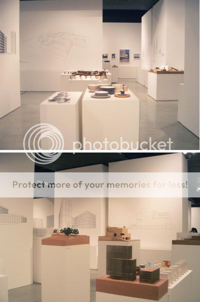
The exhibition design was stunning. I can see that David Chipperfield had real input into the way the space was set up, as the design employed many of the features that he uses in his buildings, in terms of creating views and glimpses. He uses a very simple, soft and natural material pallet in his buildings and this really came across in the exhibition. Here are a couple of photos I took (flash photography wasn't permitted, hence the poor quality).


Form Matters - Design Museum.

I love looking at architect’s sketches and David Chipperfield’s are a real joy. This is what he says about drawing:

“From the initial sketches in black pen and ink in response to a brief, the unsentimental precision of the line drawings which reduce a form to its essence to test a concept to its limits, drawings are central to the process of turning ideas into buildings.”

This makes me realise that I must draw more when designing. I tend to use sketch models as I’m more comfortable working in three dimensions when designing space, but drawings really are crucial at the beginning of a design. I find a blank piece of paper scary and feel that my drawing skills aren’t good enough, but I really must give it a go.


Sketches by David Chipperfield.

I’ve given an overview of the exhibition from an interior designer’s point of view, as I’m most excited by the internal spaces, but here are some of his buildings shown externally.


Gormley Studio (UK), River & Rowing Museum (UK), Des Moines Public Library (USA) Am Kupfergraben 10 (Berlin). Source: David Chipperfield

Talking to strangers

3 Dec 2009


I went to see the Sophie Calle exhibition at the Whitechapel Art Gallery in London yesterday. I hadn't actually heard of her before but I've since learnt that she is one of France's best known conceptual artsists, and I found the main exhibit entitled "Prenez soin de vous" ("Take care of yourself") to be right up my street!

Premiered at the 2007 Venice Biennale, "Take care of yourself" is named after the last line of an email that an ex-boyfriend sent her. Sophie asked 100 women to read and interpret the meaning of the letter... and the results were hilarious! A translator picked apart the letter, pointing out that it had been written using the polite form of you (vous) which is a rather formal way to address a lover. A musician wrote a piece of music based on the letter, and there was even a parrot chirping away with its "comments". A rifle expert simply shot a hole through the letter! It was quite a moving experience seeing each analysis: I felt sad that their relationship had come to such an abrupt end, and anger at her ex-boyfriend for being so self-centred and arrogant.

The exhibition is very exciting in terms of the way the space is used and the experience that the viewer undergoes. To see the title of each piece the viewer must look up really high, then they need to read, listen and watch. They go on a journey around the space, sit down and look through some photos scattered across a table, then continue walking. One of the gallery rooms showed an interview with Sophie Calle and the interviewer felt that Sophie had really revolutionised the way you look at things. When you read across a wall, you physically go on your own journey along that wall.

Here's a really interesting short documentary about Sophie Calle's work: