Showing posts with label Architecture. Show all posts

John Pawson - Design Museum

13 Jan 2011

Photobucket

Today, I visited John Pawson - Plain Spaces at the Design Museum. Pawson was one of the first architects that my tutor introduced me to when I started studying Interior & Spatial Design, and I would regularly look through his books and projects throughout my course. His style is simple, calm and timeless.

At the centre of the exhibition is 1:1 scale architectural installation. The photo above is the view when you reach the top of the stairs and enter the gallery space. There is a thin layer of fabric mesh between us and the room which creates a misty, dream-like feeling. People were walking up to the mesh to see what it was. There is a way into the room later on in the exhibition, and this is the view from the other side:

Photobucket

Photobucket

Pawson is well-known for his 'floating' elements and it was a joy to sit on one of his benches. The timber is soft and warm to the touch, and the 'weightlessness' is stunning, and quite remarkable.

Photobucket

The photo below is the same view as in the first image, but this time standing in front of the mesh screen.

Photobucket

From listening to an interview, I learnt about his design ethos, which is centred around creating an experience for the visitor. He said that when he was about 12 years old, he walked into a building which made him feel a certain way, and he knew that he wanted to one day design buildings that trigger an emotional response or affect the visitor's mood.

Photobucket

He starts a project by sketching and then moves onto making physical models. He said that the models are left out on the desk the whole time, and by looking at them each day they trigger new ideas. The models are photographed to create life-like views which can be developed further. Below are photos I took inside models of two different Chapels.

Photobucket

They were quite small, but so detailed and realistic!!

Photobucket

For Pawson, each project needs to have one big idea behind it, so it has some meaning. The materials usually have meaning and a relationship with the surrounding context. The following part of the exhibition was my favourite, as projects were displayed with real samples of materials. You can read about the building and simultaneously feel the materials. When looking at projects in books, I often find it hard to imagine what the materials are really like. In the book you just see colours, but in real life you can feel the texture, warmth/coolness, see reflections...

Photobucket

Sackler Crossing, Kew Botanical Gardens

Black Granite - deck
Bronze - balustrade

There was a video of this walkway and the way the bronze reflects in the water is stunning. I'm planning to visit when the weather warms up!

Photobucket

Baron House

Falun Black Timber - external shutters, entrance cladding
Corrugated Zinc - roof

Photobucket

Cricket Pavillion, Oxford

Oak - cladding
Marble - roof

Photobucket

I enjoyed this exhibition immensely and found it to be really inspiring for me, on a personal level. I can relate to John Pawson's way of working with a physical model, and intend to continue to work in this way in the future (despite often feeling pressure to design in CAD). I learnt that materials are so important and need to complement the enviroment as well as each other. For a simple design to be successful, the material pallett needs to work perfectly. A simple design can't be cluttered with lots of materials; fewer materials create a calmer, more cohesive environment.

Resources:
- John Pawson
- Plain Spaces Blog

*all photos taken by me.

Rotating Bookcases

29 Apr 2010

rotating bookcases

I'm relieved that I'm now fully absorbed in my university project. As part of the Language Centre that I'm designing, there will be a library. I found these images of a library in Brussels which incorporates rotating bookstacks. I'd like to apply the concept of rotating bookstacks and other furniture to my design, to give the option of one large open space or several closed-off private areas. I've reached the fun part of my project and it's quite exciting!

*Images scanned from The Architectural Record. Issue 7, 1997.
Bibliotheca Wittockiana by Igloo Architects.

Cube Pods

26 Apr 2010

goldberger
goldberger
goldberger
goldberger
goldberger
goldberger goldberger

How could I not post about this, the moment I saw it?! It's an office that has been divided by CUBES..! How ingenious is that?! This project really does excite me, and I think it's because it kind of sounds like a student concept, but the project has been lifted off the paper by Hungarian architects Benedek and Lakos and realised in such a beautiful way. I love the tension of the boxes within the existing building (a former textile factory) and the way this has been played up with the use of dramatic LEDs to make some cubes appear to float. Apparently the space transforms into a nightclub in the evenings -- talk about getting value for money with this space! It's never empty!

*All images from tervhivatal. Found via Dezeen.

Translucent Inspiration

22 Apr 2010

Photobucket
Photobucket
Photobucket

1. Extension of Kunsthaus Gallery, Zurich - David Chipperfield (image)
2. The New Residence of the Swiss Embassy, NY - Steven Holl (image)
3. Cottbus Library, Germany - Herzog & De Meuron (image)
4. Spa, Switzerland - Curiosity Design (image)
5. New Synagogue, Germany - Wandel, Hofer, Lorch & Hirsch (image)

Following on from yesterday's post, here are some images of translucent materials that inspire me.

Isn't it funny how the first two buildings - by different architects - are so similar? Look at the printed text on the glass in the third building - it's just what my project is all about! (Although I will be using this idea on a much smaller, more personal level inside a building). The silk and linen screens in the final two photos are so calming and serene. I like the quality of light filtered through soft, natural materials like these.

Natural Slats

13 Apr 2010

Photobucket
Photobucket
[Images: Natural Slats by EDH]

When I saw this house by Endoh Design, I fell in love. It's so clever that the slats provide privacy from one direction and then the building looks open from another angle. I'm sure the angles of the slats were carefully calculated to take into consideration how the natural sunlight falls. Overhead beams/slats continue across the roof terrace, keeping the line of the building but providing open air space. Like all Japanese architecture, this building is striking and elegant.

Sliding panels

3 Apr 2010

[Images: House in Midorigaoka, Japan by Camp-Design inc. Found via Dezeen]

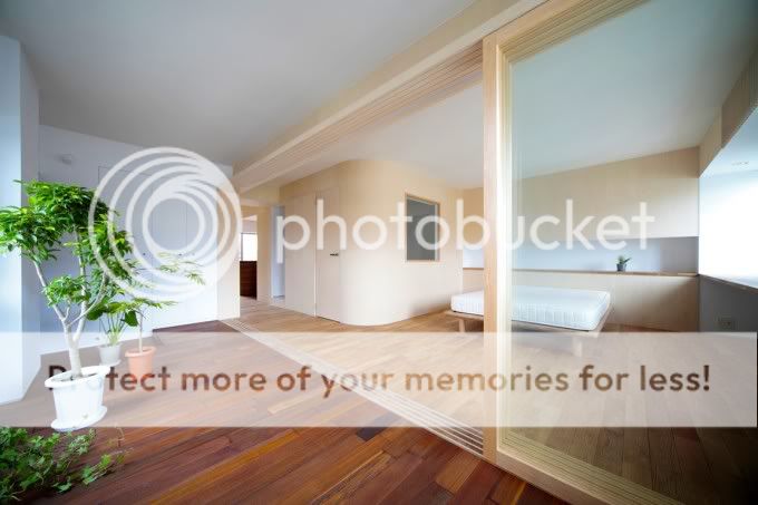
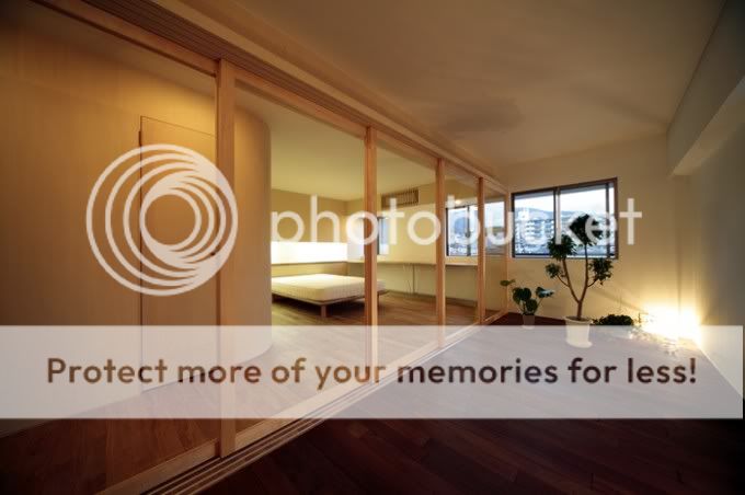
I find the sliding walls and panels in this design very appealing. This idea has been applied internally and also to the wall that connects to the outside space. It would be very interesting to mix up the opacity of the panels: transparent as well as solid panels to offer different degrees of privacy. I think the detailing on the sliding runners is quite beautiful. When all the panels are pushed to one side, one huge space is created -- ultimate flexibility. Who needs fixed walls?

Raven Row

21 Jan 2010


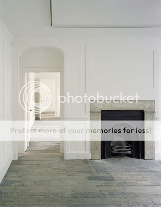
This week's lecture at university was by Tom Emerson, who is a director at 6a Architects, and he talked us through a recent project. Raven Row is a new non-profit exhibition centre in London located in two 18th century silk mercers' houses in Spitalfields. The building incorporates contemporary art galleries, two flats for artist residencies as well as studio space. 6a Architects totally renovated the existing buildings and created two new galleries in an excavated basement.

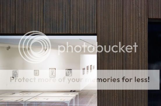
The building was ravaged by a fire in the 1970s. Every part of the building was covered in a thick layer of char, but surprisingly the ornate features were not totally destroyed and could be restored.


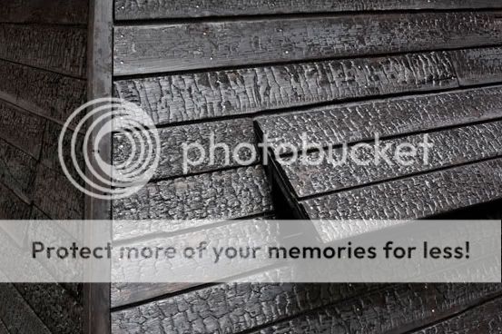
The notion of burning is a recurring theme throughout the project. Inspired by a traditional Japanese method of cladding buildings with burnt timber, the architects carried out a series of experiments. Surprisingly, charred wood protects a building from fire (as the wood cannot burn twice) and is very resilient to the elements. Part of the roof is clad in burnt cedar which can be seen from various points around the building.


Burnt timber is resilient to the weather, but it will soon disintegrate if touched. They cast the charred timber in iron and used this on one of the façades, which introduces the texture of burnt wood but in much more hard wearing material.


These are ventilation holes in the iron panels.


The staircase in the new basement was inspired by a traditional 18th century cantilevered staircase, and they designed and cast a modern version in concrete. It's incredible that each step overlaps by only a few millimeters but is so strong. There is a 'swelling' at the end of the balustrade which is a reference to a traditional scroll.


The most amazing aspect of the project is that they actually managed to find one of the original Rococo interiors in America and reinstall it! After the war, many 18th century rooms in England were striped and sold to America. The interior panels were shipped back in several packages, and over a period of 6 weeks the room was pieced back together. It's ironic that this interior was absent during the 1970s fire, and as a result it is the only completely intact interior in the building.


This entire project is inspired by holding onto lost stories and memories of the building. Some of these stories are based on word of mouth, such as incidental facts from a lady who lived in the building her entire life, and others are based on a catalogue of photos they discovered in the London Metropolitan Archives.


There are many layers of history on this site and prior to the 18th century building there was a building dating back to the 16th century, and some of these original fireplaces still remain. Tom likened the building to a palimpsest.

In keeping with the notion of trace, they designed door knobs that incorporate a thumb indentation, which brings a beautiful tactile quality to an every day object.


It was most interesting when Tom explained that the narrative of the project evolved naturally, and it wasn't until they reflected several months later that they discovered everything they had added to the building was either burnt or cast. He said that if something is too premeditated the project becomes inflexible. At university we are told not to post-rationalise, but their method of acting on instinct and reflecting later has produced a really elegant and honest building. The pieces of the puzzle came together naturally as they discovered more stories about the building.

Tom said that although there is an underlying narrative, it was never presented to the client in this way. The client needs to know how the building will perform as a gallery, and how the money is being spent. As an architect he needs to be able to speak about the same project in a variety of ways for different audiences (e.g. client, colleagues, builders, planning officers).


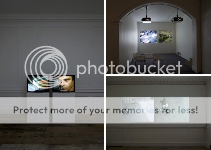
This was the most inspiring lecture so far (which is evident from the length of this post!) and I'm planning to visit the gallery soon. At the moment there is a film exhibition by Harun Farocki and the rooms are very dark. The screens and projectors provide a similar level of light to the flames from fireplaces that would have been used in the 18th century, so it's an exciting and unusual time to experience the space.

White Townhouse: Hot or not?

20 Jan 2010


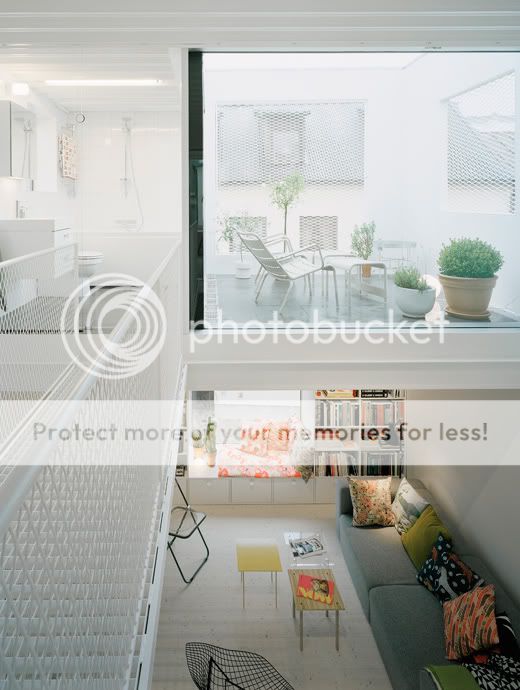
I can't decide if I like this Swedish townhouse or if it's just too brutal and unsympathetic to the traditional neighbouring houses. From some angles it seems to fit in but in other photos it seems so loud.

But this is what the architect, Elding Oscarson, says: "The building relates to the surroundings in scale, proportion and in the way it adds to the established rhythm of low and tall buildings along the street." [source]

The site was empty for over 50 years, so this new building has definitely added value to the street.


Rather than copying the style of the traditional houses, this townhouse reflects the design of today, and in a few decades people will look at it and admire the layers of history in the street. This is seen in London a lot: there are streets with buildings spanning several centuries, and then a modern building will spring up. Why shouldn't we juxtapose ultra-modern with traditional? They did this in the 19th century when they built next to 17th century buildings.


I'm attracted to the simple lines and the minimalist windows, especially the opening in the roof that has created a perfect roof terrace (photo above).


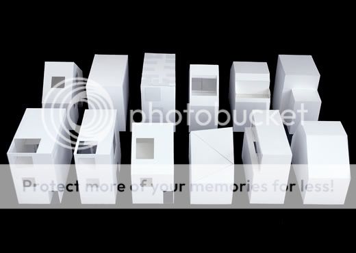
This final image is the most exciting to me as it shows the different options that the architects considered before settling on the final form.


[All images: Elding Oscarson. Found via: Dezeen.]