Formable Furniture

21 Dec 2009


[Photos: Yanko Design]

I love the concept of Formable Furniture designed by Reed Crawford. The interlocking pieces are connected by a wire, and when you tug on the cable you can manipulate the tension to create new forms. It's like a game for adults: imagine being able to create a new piece of furniture whenever you get bored of the shape!

This would be great for people who move home often as you could create a new piece of furniture that fits into your new place perfectly. It makes financial sense: if you find you need an extra chair for a guest, just transform your table into a chair without having to go and buy one! But if it came in white, grey and some bright colours I would love it even more.

Vegan Cookies


I made a double batch of cookies last week. The sort with a crisp outer shell and a soft, crumbly centre... mmm my favourite. I originally found this recipe on Parsley Soup a couple of years ago. They require very little oven-time, so they're ideal emergency cookies. I doubled these quantities and made a chocolate chip batch, and then added cocoa powder into the second half of the mixture for double chocolate chip.

Ingredients

100g (4oz) soft vegetable margarine (I use Pure soya spread)
100g (4oz) caster sugar
150g (6 oz) self-raising flour (plain flour makes much flatter, denser cookies)
1 tsp vanilla extract
100g (4oz) dark chocolate chopped into little pieces
1 tbsp cocoa powder

Instructions


Beat the margarine and sugar until fluffy. Then add vanilla extract, chocolate chips and cocoa powder for double-choc cookies, then stir in flour to make dough. If the mixture won't form a dough, add a little soya milk. Shape the mixture into 16 balls and flatten slightly (or 8 balls for larger cookies). Place on baking tray lined with grease-proof paper and bake for about 8 minutes at 200˚C/400˚F (slightly longer for larger cookies). Leave to cool slightly before transferring onto a cooling rack.

Top Tip: For a delicious dessert, crumble cookies over vanilla Swedish Glace ice cream :)

Snow Day!

19 Dec 2009


Everywhere looks so beautiful when it's covered in a blanket of snow. Yesterday I went for a walk in the park in very inappropriate footwear but it was fun! The snow this year seems too powdery for building a decent snowman. Has anyone else had this problem? My favourite photo is the first one: the tree trunk looks like a white line in the sky! It doesn't snow that often in London so maybe this is normal, but my neither my husband nor I have ever seen snow settling like this before. Even the lamp posts and road signs were covered in the same way - so funny!!

Space of the week #1

17 Dec 2009


Designer: Luca Andrisani. Images via: Apartment Therapy & Luca Andrisani

I first saw these photos in Apartment Therapy's Small Cool 2008 contest. I added the page to my favourites and I pop back from time to time as it's a look that I just adore and find very inspiring. To me, the design is just perfect: the clean lines of the timber contrasted against a crisp white backdrop. It's striking yet unfussy.

I've decided to start a Space of the week feature so I can keep track of my tastes and see how they develop over time. I've chosen the notion of Space as opposed to Room of the week as I feel this title covers everything from interiors to buildings. I often find it tricky to articulate the reason why I like something. I instinctively know what I like, but I'd like to get better at expressing the reasons behind my choice.

Do you think it's always possible to pinpoint exactly why you like something, or do you sometimes just get a gut feeling?

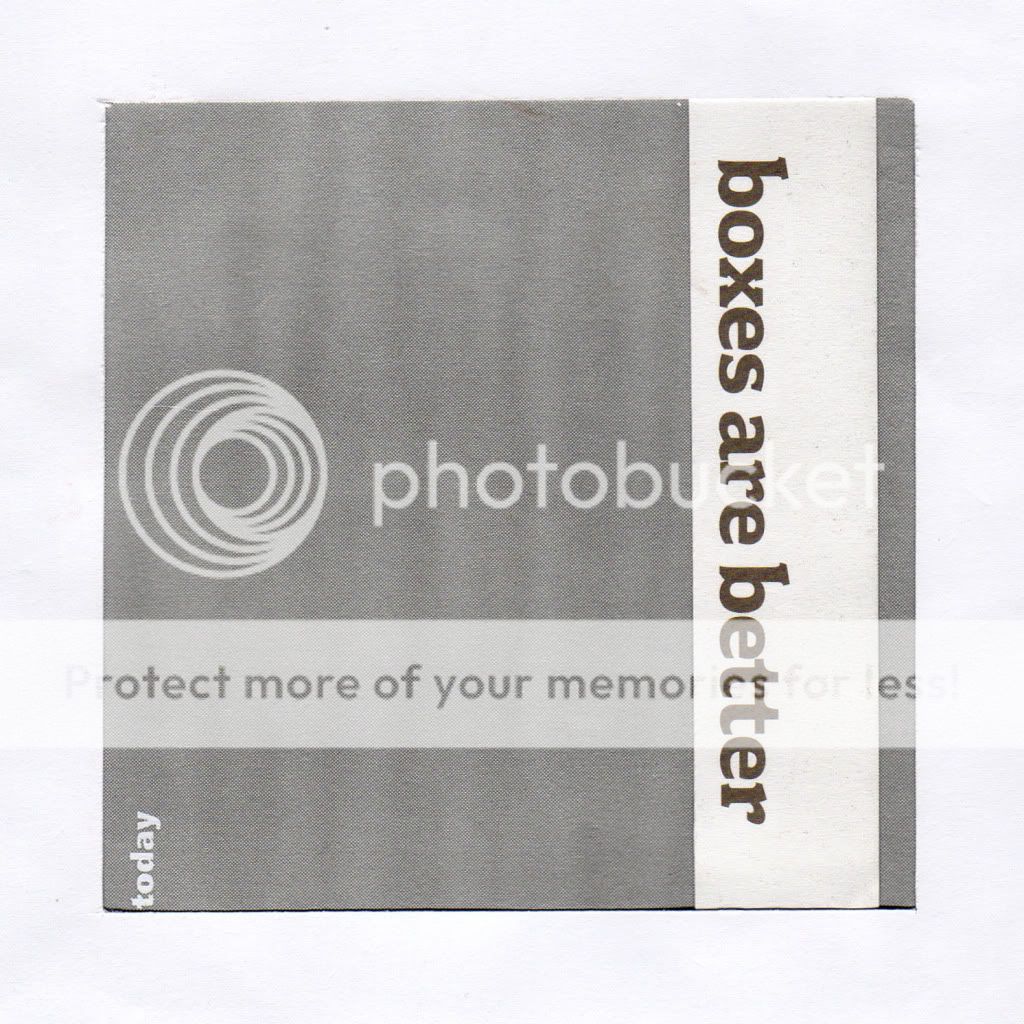
"Before you can think out of the box, you have to start with a box"

16 Dec 2009


I ordered this book from Amazon today. It's not like me to buy something in haste but I'm searching for some much needed motivation over the Christmas holidays. I need to work on my university project and at the moment it feels like an insurmountable task. I wish it was just a standard design project. I'd love to take a site and start designing, and that's what I thought I could do. But my Masters is meant to be "research based", and apparently my idea for my project wasn't addressing any of my original research concerns. It feels like I need to start back at square one again. Maybe I'm making it sound worse in my head than it really is. We'll see... I just hope this book will give me some much needed encouragement. At the moment I seem to be the Queen of procrastination.

EAMES: Powers of Ten (Post 3/3)

This is the final article in this Eames mini-series, and I feel that this one in particular demonstrates the sheer diversity of Ray and Charles' talents. Powers of Ten (1977) visually expands and then contracts the universe as we know it. The film will take you on a thrilling and unnerving journey. Enjoy.

Isn't it astonishing that they they achieved this over 30 years ago? I read that this film is used as a teaching resource in schools. I wish I'd seen this as a child - it would have made me really excited about science!

Have you enjoyed this mini-series? I'd love to receive feedback from you!

EAMES: Arts & Architecture Magazine (Post 2/3)

15 Dec 2009

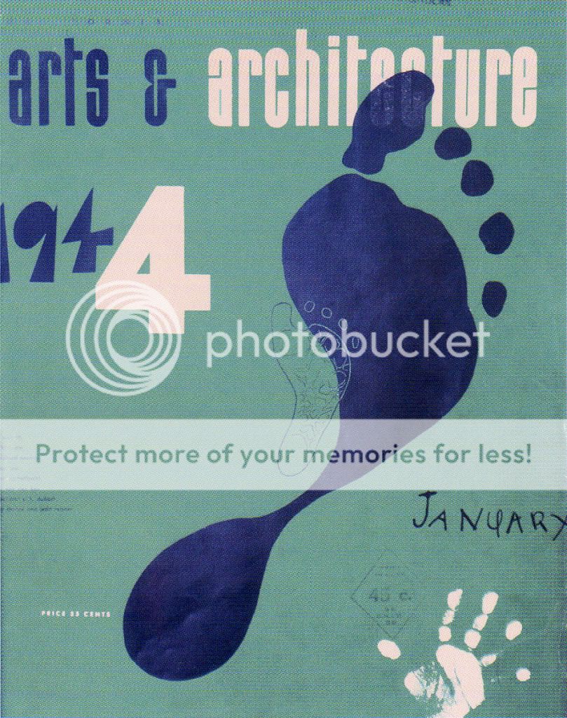
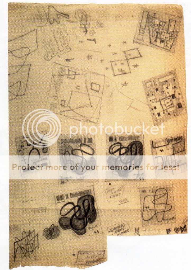
From 1942 to 1947, Ray Eames designed 28 covers of the Arts & Architecture magazine. She often used Charles' current photographs in her compositions and, if relevant, also incorporated the experimental work going on in the Eames Office at the time. Aren't these covers spectacular? Each one is a true work of art.


Image credits: Arts & Architecture Covers 1-3 and Cover 4, Ray Eames' sketches for Arts & Architecture

I especially like the last image of which shows sketches of various page layouts. As I've previously said, here and here, I LOVE seeing the process that artists and designers take to get to a final product! There's an online archive of magazine covers from 1945 to 1967 but I didn't dare post images from there as the site requires a commitment to their copyright policy. Take a look for yourself - it's an incredible resource.

Check back tomorrow for the FINAL Eames post. When I first saw it, I was astonished how cutting-edge Charles & Ray were for their time!

EAMES: A Perfect Partnership (Post 1/3)

14 Dec 2009


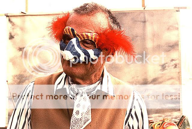
I adore the work of Charles and Ray Eames and they always look like they were having so much fun together. Their designs are very playful and this aspect of their characters is expressed beautifully in these photos. In most pictures I've ever seen of them, they are either smiling, looking at each other, or doing both! I enjoy looking at photos of them almost as much as I like their designs (does that sound crazy?)! Their designs are a reflection of their personalities, so really it's one and the same. I can just imagine the fun they must have had setting up these shots. I love photos that capture the essence of someone's character...


Photo credits: On a Triumph motorcycle, Posing with sculpture for their 1944 Christmas card, Wearing matching gingham shirts they pose within metal DCM bases 1947, Sitting together on La Chaise, Charles taking a photograph, Ray with cat mask 1971, Charles with clown mask 1977

Check back tomorrow for the SECOND edition in the Eames mini-series where I'll show you a stunning project by Ray Eames that you probably haven't seen before!

Fragment collages

13 Dec 2009

I made these collages today using some old envelopes and leaflets. When I took the lines of text out of context they became quite funny and I had some fun playing around. I used to make collages out of pretty handmade paper, but recently I've been keen on only using bits of paper that come through the post which are not always beautiful. The collages are a fragmented glimpse into my life (or mail!).


On reflection, I definitely think that when picking out the lines of text, I was influenced by the context of my day (i.e. spending about an hour queuing at the post office!). This might be a fun and interesting way of scrapbooking/journaling.. picking out lines of printed text, rather than actually writing myself.

Aram Store = Heaven

11 Dec 2009


Photo credits: Metrotwin, renaissancechambara on Flickr

Aram Store holds one of the largest ranges of modern furniture and design in London and was founded by Zeev Aram over 40 years ago. It's located in a massive five-storey fruit and vegetable warehouse and the array of design is breathtaking. To give you an idea: the chair section doesn't just have half a dozen chairs on display, but more like 20. In every colour. You can easily spend a few hours exploring everything. The great thing about it being a showroom and not a museum of design is that you're free to get up close to each piece and see how it works, how it feels to the touch, or how comfortable it is.

My favourite items available in the store are these rugs designed by Eileen Gray in the 1920s and 1930s that Aram Store has reintroduced to the market. I always find it astonishing how forward-thinking her designs are for the era she worked in.

Here's a fascinating interview filmed by Dezeen with the store founder, Zeev Aram, talking about the transformation of the design scene in London in the 1960s and why the endless supply of creative talent makes London so unique. It lasts about 8 minutes and is well worth listening to!


And finally, I'm very excited about MONDAY as I'll be posting the first edition in a mini-series about Charles & Ray Eames, so make sure you come back then! I won't be focusing on their designs as such, but on some other aspects that I find so appealing. I promise it'll be fun!

1950s architectural sketches


Here are some more pages from the July 1951 edition of the Architectural Review that I got my hands on this week. I think the drawings and collages communicate the ideas in the article really clearly. I adore hand drawings like these, and my favourite is the last picture with the lamp posts drawn on. I think I'll try out this kind of technique myself!

Don't you think the drawings are delightful?!

Dear Santa...

10 Dec 2009


"Bobby" desk lamp: £19 Habitat
"Brattle" cushion: £34 John Lewis
Marimekko porcelain plate: £21 Twenty Twenty One
Les Oiseaux vase: £71 Ligne Roset

A few of the things that I've been dreaming about lately. Sadly I need to save my money for more "useful" things, but maybe Santa will pay me a little visit this Christmas... I've loved the vase since I set eyes on it a couple of years ago. Isn't it beautiful?!

Less and More

9 Dec 2009

"Question everything generally thought to be obvious" - Dieter Rams


Photos taken at Less and More, Design Museum, London: Alphanumeric on Flickr

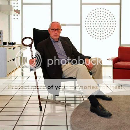
When I visited the Design Museum last week, I had a look at Less and More. This exhibition celebrates the work of Dieter Rams whose design ethos influenced Braun's range for over 40 years.

I really enjoyed reading Dieter Rams' 10 principles of good design. I can identify with each point; they are all so true. I think my favourite is the last one as I always feel the simplest designs are the most powerful. To produce an uncomplicated and minimal design is not easy.


Good design is innovative.
Good design makes a product useful.
Good design is aesthetic.
Good design makes a product understandable.
Good design is unobtrusive.
Good design is honest.
Good design is long-lasting.
Good design is thorough down to the last detail.
Good design is environmentally friendly.
Good design is as little design as possible.

Retro Magazine Bargain

8 Dec 2009

As I was leaving university today I noticed some old magazines for sale in the library. As I got closer I saw that the trolley was overflowing with copies of the Architectural Review from the 1950s. I got all hot and bothered, like I do when I'm in my favourite clothes shop and don't know where to look first. After about 30 minutes of rummaging I came away with 8 magazines for £2! The librarian said they'll be reduced to 10 for £1 next week. I think I'll need to bring in my wheelie suitcase to get them all home. I simply can't turn down such a deal.

I haven't looked through the magazines in any depth yet, but here are some quaint little adverts that I simply love. They are so simple and honest, unlike the manipulative adverts of today!


Architectural Review editions ranging from July 1951 - February 1959

Unto this last

7 Dec 2009


Nurbs Chair, Facet Sideboard, Cell Shelf, Coat Stand - Unto This Last

In their workshop in London's Brick Lane, Unto This Last creates stunningly unusual furniture at mass-production prices. Items are made from digitally cut plywood that's available in a range of finishes. The designs are classic and understated, often incorporating soft contours (imagine how comfortable that chair must be!). And I rather like this plywood Christmas tree...


Christmas Tree - Unto This Last

A house that rotates?!


Photo source

This incredible idea was born after the owner said, "Wouldn't it be handy to have a house that could move?"

Based on the weight of the average house, they discovered that the mechanism need only consist of two small electrical engines no larger than that of a washing machine. They designed this octagonal shaped building with a 360˚ veranda that sits on a platform and follows the sun all day long. The mechanism is simply controlled by a touchpad in their living room.

Isn't it wonderful that technology has enabled this fantasy idea to be realised? If a client says they want you to build them a house that receives maximum sunlight, you just wouldn't expect this to be a plausible solution. You might imagine floor to ceiling windows or for the house to be orientated in a particular direction - but not a house on a rotating turntable!

This has taught me that no idea is too outrageous to dismiss. That initial crazy thought might be the key to the whole project!

Designing in watercolour

4 Dec 2009


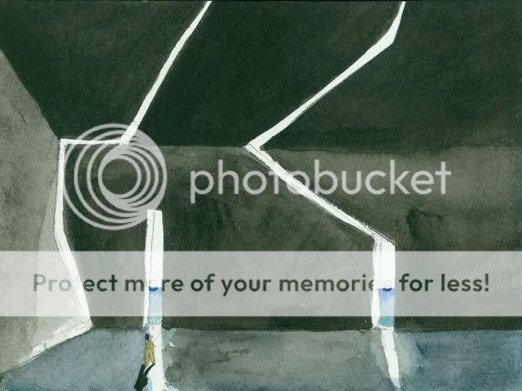
Source: Steven Holl

In my post about the David Chipperfield exhibition I said that I love looking at architects' sketches, and I think Steven Holl's watercolours are my favourite. He has an incredible ability to carve out space with the paint, creating a real depth. I love the intensity of the shadows in contrast to the bright areas of white light. I see an ambiguity in some of the forms, as they could apply to any scale - he may have intended them to represent buildings, but I interpret the forms as walls or furnitutre. Rendered perspectives can often be sterile, especially when created on the computer, but these watercolours have a real atmosphere and feeling about them.

About painting, Steven Holl says, "There is a joy in this way of beginning; it's inspiring and light, and I feel it's in my blood. I open my eyes. It's a new unpredictable day; I have a yearning, and it's unappeasable sometimes."


I'd love this book of his watercolours for Christmas.

Is there a particular architect or designer that inspires you?

Stadium X

Last week I had the opportunity to attend a lecture by Polish curator, Joanna Warsza. In 2007, Joanna set up The Laura Palmer Foundation (borrowing its name from David Lynch’s film Twin Peaks) which is an independent company that produces conceptual exhibitions, participation events, staged situations and performances. The Laura Palmer Foundation functions on the verge of fiction and reality and “treats curating as an art form”.

Joanna spoke about some of her recent projects, and one that I know I won’t forget for a long time was called “Boniek!” We were shown a short film clip, and I’m telling you, it was absolutely hilarious! I need to set the scene before you watch the film. The Laura Palmer Foundation was working with a derelict ex-communist stadium in Warsaw, called the 10th Anniversary Stadium. It was built after the Second World War, but was totally dysfunctional for various logistical reasons, and had been disused since the 1980s. Joanna worked with Swiss performance artist Massimo Furlan, and he came up with an incredible idea for a performance art project.

On his own, Furlan re-enacted one of the most spectacular games in the history of Polish football: the Poland-Belgium 3-0 match at the 1982 World Cup in Spain. He reproduced the choreography of the match’s hero Zbigniew Boniek, who scored all three goals. The match was reported live by Poland’s leading sports commentator Tomasz Zimoch and broadcast on the radio. Some 700 people attended this historical “match”. In keeping with the nature of participatory art, the crowd was asked to join in with the action and support the Polish team. The original football coaches who were present at the match in Spain in 1982 even attended.

Here’s the video of the re-enactment. The commentary is in Polish with no subtitles, but I saw a subtitled version at the lecture and he’s just saying all the standard stuff. You can get a feeling for it just from the tone of his voice.


The reason I like this so much is because it’s so simple and witty. It’s just hilarious to see Furlan running around the pitch kicking an invisible ball with the commentator getting more and more excited. The seemingly standard sports commentary that we hear creates some sense of reality, but there are many visual oddities such as the disparity between the small number of supporters and the enormous stadium, and the fact that there’s only one player. The line between reality and fiction is blurred. For a moment we might see Furlan as the footballer Boniek, and then we see him as a 40-year-old man prancing around an empty pitch. In the lecture, Joanna explained that when this was filmed the spectators were the “audience”, but in fact the spectators are the “performers”, and we are now the audience watching the film. The fact that the spectators got involved with the match “distorted the distinction between artist and audience, creating a non-hierarchical space of social exchange”.

Form Matters

I visited the Design Museum yesterday and saw David Chipperfield’s exhibition, Form Matters. I can’t tell you how much I love David Chipperfield. He was the first architect that my tutor introduced me to last year and from the moment I saw his work I realised I’d seen pure perfection. I admire the way he creates internal spaces within his buildings: he creates light and bright interiors that aren’t sterile in the slightest. He creates glimpses and selects views that guide your sight. I listened to a podcast and he sums up his architectural aesthetic as “modest, with simple concepts”. His style is very elegant and restrained. His designs are stunningly beautiful, yet understated.


Some of my favourite interior views. Source: David Chipperfield

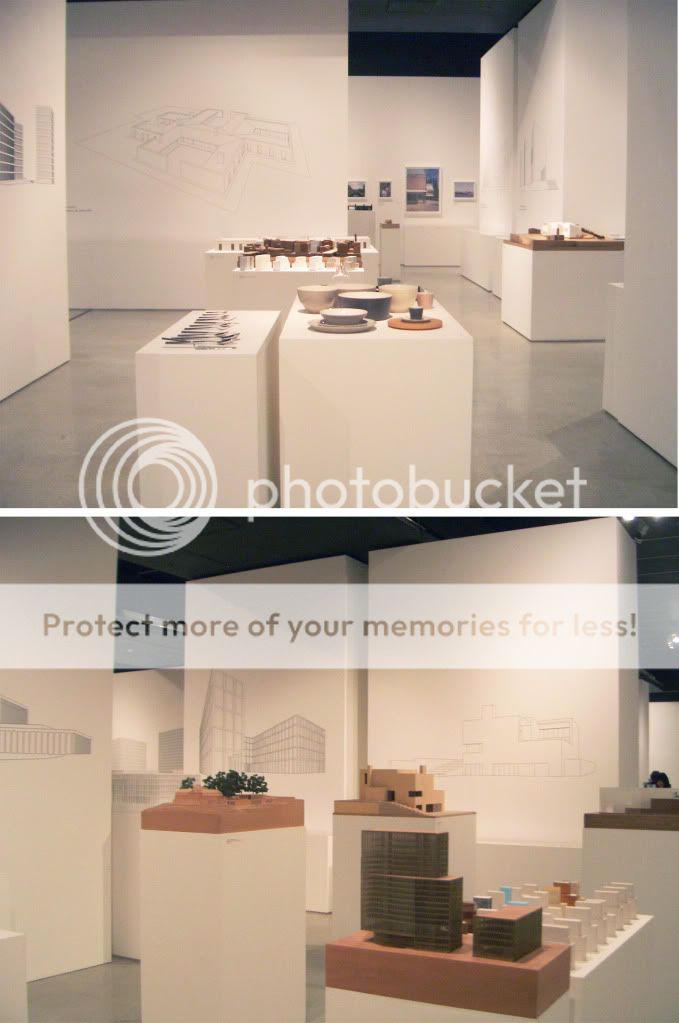
The exhibition design was stunning. I can see that David Chipperfield had real input into the way the space was set up, as the design employed many of the features that he uses in his buildings, in terms of creating views and glimpses. He uses a very simple, soft and natural material pallet in his buildings and this really came across in the exhibition. Here are a couple of photos I took (flash photography wasn't permitted, hence the poor quality).


Form Matters - Design Museum.

I love looking at architect’s sketches and David Chipperfield’s are a real joy. This is what he says about drawing:

“From the initial sketches in black pen and ink in response to a brief, the unsentimental precision of the line drawings which reduce a form to its essence to test a concept to its limits, drawings are central to the process of turning ideas into buildings.”

This makes me realise that I must draw more when designing. I tend to use sketch models as I’m more comfortable working in three dimensions when designing space, but drawings really are crucial at the beginning of a design. I find a blank piece of paper scary and feel that my drawing skills aren’t good enough, but I really must give it a go.


Sketches by David Chipperfield.

I’ve given an overview of the exhibition from an interior designer’s point of view, as I’m most excited by the internal spaces, but here are some of his buildings shown externally.


Gormley Studio (UK), River & Rowing Museum (UK), Des Moines Public Library (USA) Am Kupfergraben 10 (Berlin). Source: David Chipperfield

Talking to strangers

3 Dec 2009


I went to see the Sophie Calle exhibition at the Whitechapel Art Gallery in London yesterday. I hadn't actually heard of her before but I've since learnt that she is one of France's best known conceptual artsists, and I found the main exhibit entitled "Prenez soin de vous" ("Take care of yourself") to be right up my street!

Premiered at the 2007 Venice Biennale, "Take care of yourself" is named after the last line of an email that an ex-boyfriend sent her. Sophie asked 100 women to read and interpret the meaning of the letter... and the results were hilarious! A translator picked apart the letter, pointing out that it had been written using the polite form of you (vous) which is a rather formal way to address a lover. A musician wrote a piece of music based on the letter, and there was even a parrot chirping away with its "comments". A rifle expert simply shot a hole through the letter! It was quite a moving experience seeing each analysis: I felt sad that their relationship had come to such an abrupt end, and anger at her ex-boyfriend for being so self-centred and arrogant.

The exhibition is very exciting in terms of the way the space is used and the experience that the viewer undergoes. To see the title of each piece the viewer must look up really high, then they need to read, listen and watch. They go on a journey around the space, sit down and look through some photos scattered across a table, then continue walking. One of the gallery rooms showed an interview with Sophie Calle and the interviewer felt that Sophie had really revolutionised the way you look at things. When you read across a wall, you physically go on your own journey along that wall.

Here's a really interesting short documentary about Sophie Calle's work: