Showing posts with label Art. Show all posts

Ready for summer

17 May 2010

Photobucket

A delicious combination of colours...

*Image by Essimar.

Henry Moore at Tate Britain

4 May 2010

henry moore
Exhibition at Tate Britain

My mum and I went to see the Henry Moore exhibition at Tate Britain last weekend. When I was a child, I used to enjoy leafing through her Henry Moore books and old exhibition catalogues from the '70s, so it was quite nice to visit this together.

henry moore
Mother and Child sketches and sculpture

The first part of the exhibition focused on the Mother and Child theme that Moore continued to explore throughout his life. Over the years, the form of the figures became more abstract. I was desperate to run my hand around some of curves in the stone, but sadly this wasn't permitted which was a shame. (My mum was worried I'd set off an alarm as she thought I was getting too close!)

henry moore
Carved stone sculpture

A lot of his early work is carved in stone, and this is what Moore said of his use of Horton stone: "...in the early part of my career I made a point of using native mateials because I thought that, being English, I should understand our stones. They were cheaper, and I could go round to a stonemason and buy random pieces. I tried to use English stones that hadn't been used before in sculpture." (source: exhibition booklet)

henry moore
Ideas for war drawings

We decided to listen to the audio guide to get a full understanding of the exhibition, but we were quite disappointed by it. We spent a lot of time walking round in circles looking for the numbered artworks and the guide mainly focused on the politcal context of the art, rather than on the actual pieces. Context is vital when appreciating art, but I would have liked to find out more about his way of working.

Nevertheless, I was fascinated to learn that Moore was one of the country's official war artists. His job was to draw the people sheltering in the underground platforms, but he felt it was disrespectful to sketch them in situ. Instead he took notes and based his drawings on newspaper photographs.

henry moore
War drawings

He got the effect in the image above on the right by using wax crayon to define the people and washing a layer of dark paint over the top. The way the wax repels the paint emphasises their ragged clothes and worn skin. It was really moving to see these pictures.

henry moore
Carved elm wood sculpture

The last room focused on sculptures that Moore carved from elm wood. The image above doesn't give any sense of scale, but they were enormous -- several metres in length and a couple of metres across. Incredibly, they are carved from a single piece of wood. Due to the size of the tree truncks, Elm has a very large grain and is therefore suited to making large pieces of sculpture. As Moore said, you can't make a small sculpture from Elm as the grain would end up in the wrong place. Although he couldn't control where the grain markings went, the lines wrap around the curves of the sculpture in such a soft, human way. These sculptures were my favourite out of the whole exhibition. There was a real softness to them. I leant that Moore was able to carve more openings in the elm than in the stone, since is was a lot softer, and the voids became equally important as the solid parts.

(* Image credits: 1, 2, 3, 4, 5, 6, 7, 8. Since photography wasn't allowed, I found images of similar artworks online. Not all of these pieces were exhibited at the Tate).

Leslie Nichols

15 Apr 2010

leslie nichols
[Images from Leslie Nichols. Text from Calligram Designers]

I love these text portraits by Leslie Nichols, and I found a short interview she gave about her work:

"Experimenting with text and image has become endless source of ideas and inspiration central to my studio practice.

Letterforms create both spatial and literary passages, which provide a visual texture that is exciting and sometimes challenging to work with.

It has been a natural evolution to use writing in my visual work. Informal sketches while doodling or writing letters to friends were my first calligrams. I began incorporating text in my fine art portraiture when I discovered a typewriter was an exciting image making tool."

Serena Mitnik-Miller

14 Apr 2010

serenamitnikmiller
[Image credits: Serena Mitnik-Miller. Found via: A Merry Mishap]

This morning I came across this beautiful and very refreshing artwork by Serena Mitnik-Miller. I especially love the painted wooden blocks. The last painting is so dreamy; I feel as though I'm lying on grass looking up to the sky through a canopy of leaves or bubbles. It's very comforting.

Ron Arad

18 Mar 2010


[All exhibition photos by me]

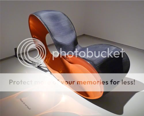
I visited the Ron Arad exhibition at the Barbican on Monday. The exhibition is called Restless and there is an underlying theme of movement. Chairs have mechanisms causing them to spontaneously rock back and forth, and there are bouncing and sliding bookcases. The pieces of sculpture are really beautiful and he used so many exciting materials: wicker covered in resin, steel, woven mesh, found objects. It was so frustrating not being allowed to touch anything!

A bit of background about Ron Arad: He was born in Tel Aviv, he moved to London in the 1970s to study architecture and made his name in the early 1980s as a self-taught designer-maker of sculptural furniture. He now works across both design and architecture.


Although we weren't allowed to test these particular chairs, some looked really comfortable and I can see that he's studied the contours of human body. But other pieces were clearly just experimental art and would have been quite painful to perch on!

I think the following chair is so elegant. I love the way the seat flows into a carpet...


In the piece below, the end of the rails lift up then lower causing the round bookcase to slide across the rails. I was expecting it to roll the whole length like a giant wheel, but it only moves a small distance. It's still impressive though.


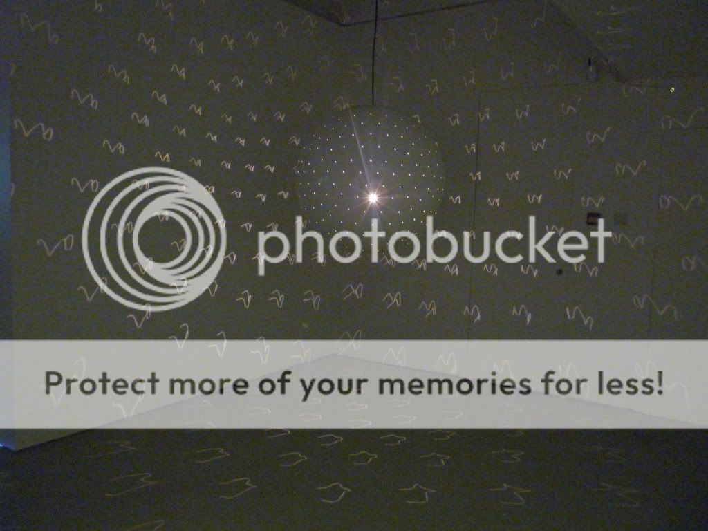
This is a light sculpture that projects squiggly lines across every surface of the room. One of my friends lightly pushed the dome and and it caused the squiggles to go crazy and move around the room. It looked like the walls were moving and felt quite disorientating!


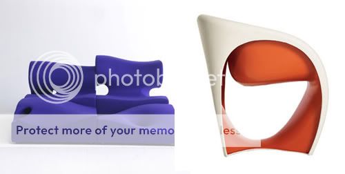
At the end of the exhibition there is an area where visitors are able to test out some pieces of furniture, which was fun. Some of the pieces looked really funky but were really uncomfortable or dangerous to sit on. But maybe we were swinging on the rocking chairs too violently! Here are a couple of my favourites:


[Image from Bonluxat]

Murals

5 Mar 2010

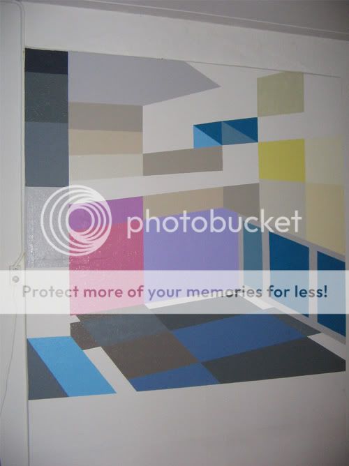
[Image credits: Bente Miltenburg's Flickr]

Bente Miltenburg is a Dutch artist who creates collages and murals, often based on perspective views of rooms. I particularly like these two murals as they look so unusual and would really add depth to the space. The first one creates the illusion of the space extending beyond the wall. I love the vibrant use of colour.

Ferdinand Penker

23 Feb 2010


[Source: Galerie Schuette]

A couple of weeks ago I attended a lecture by minimalist Austrian artist, Ferdinand Penker. His work is inspired by his vast collection of cheese graters; they are almost identical but each one has slight variations. The notions of series and repetition are central to his paintings. He creates paintings in which he repeats the same colour over and over again, where there are only small variations in the texture of the brush strokes. These are displayed in rooms where every available piece of wall is covered in nearly identical paintings.

Although I do like his paintings and other creations, I was particularly drawn to the ones above which are a collaboration between Ferdinand Penker and Trevor Sutton. The pencil markings on masking tape are the cast offs from Penker's own drawings (the tape is used to stick drawing paper to his desk, and when his pencil veers off the page the masking tape is marked), and it has been layered over a geometric painting by Sutton. I'm not the best art critic, but I do like the way the lines, colours and textures intersect.

One thing that Penker said that I will try to remember, is that drawing can help you achieve a real sense of concentration, and it's important to just draw for the sake of drawing.

Castle and Things

11 Feb 2010


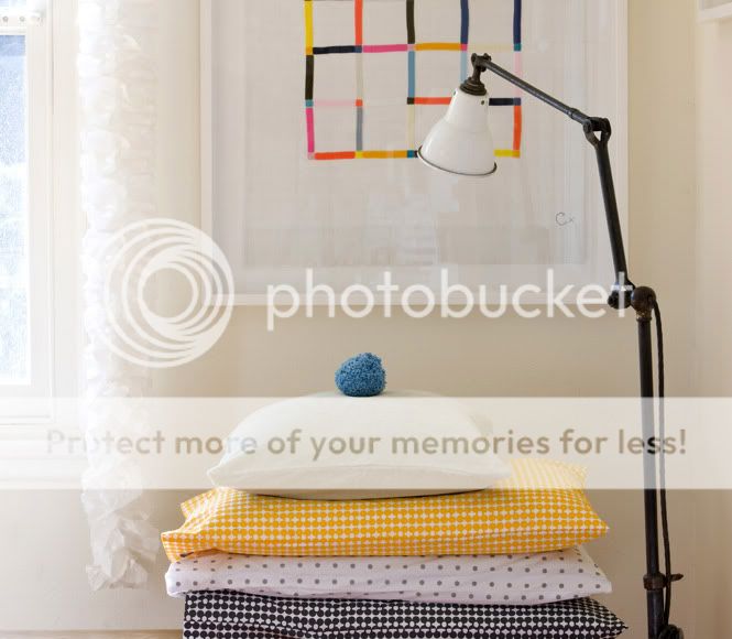
I neeeeeed some of this bedlinen and artwork by Castle to brighten up my home ready for the spring! Isn't it pretty? I'm really in love with the splashes of sunny yellow.

Carving my initials

6 Feb 2010


[Images: Prints of original artwork by Carving my Initials available on Etsy]

Aren't these pictures enchanting? Some of the markings look ambiguous and make me wonder if they were intended to be part of the picture when the artist started the piece, or are they test sketches that were used to decide on the final composition? I love the gradient of soft colours in the last picture layered over the pencil.

Chris Ofili at Tate Britain

5 Feb 2010


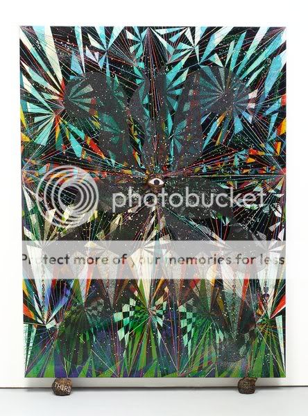
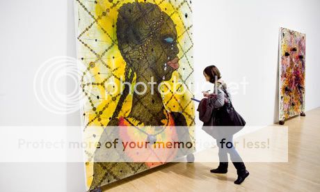
I saw the Chris Ofili exhibition at Tate Britain on Wednesday. I didn't know anything about this artist, so when I entered the first room and noticed elephant dung on his paintings I was slightly shocked! But I was immediately blown away by the stunning colours. When you go up close, you can see layer upon layer of dots in vibrant colours. Close up shot of texture:


I've since learnt that Chris Ofili started using elephant dung in his paintings when he was in Zimbabwe. He says, "[Using dungballs is] a way of raising the paintings up from the ground and giving them a feeling that they've come from the earth rather than simply being hung on a wall." [Quote from exhibition leaflet]. When I read this, it made much more sense to me.


It's a large exhibition with 7 rooms in total and my favourite was the Upper Room which takes you on an extraordinary sensory experience. The paintings are displayed in a specially constructed vault designed in collaboration with architect David Adjaye.

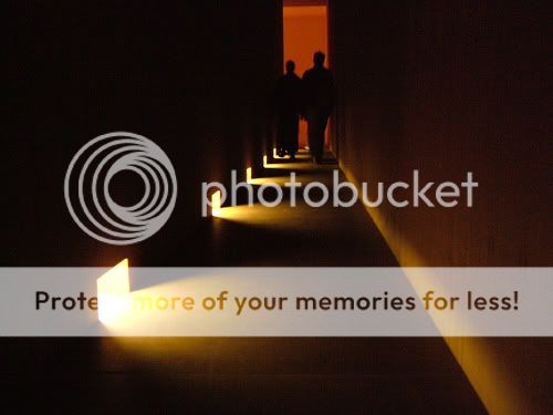
To enter the vault you first pass through a long corridor which is completely dark apart from some illuminated openings along the floor. It's quite scary walking in the dark but the lights entice you further into the space.


When I reached the end of the corridor and turned the corner, I was amazed that the entire space was clad in beautiful timber - floor, walls and ceiling. The texture was lovely, as it felt smooth but also quite raw.


The lighting is exquisite. Each painting is illuminated by a single directional light from above, and it is this light that shines through the openings behind the paintings into the corridor. The paintings literally glow against the dark timber backdrop, and the light is reflected in a pool at the foot of each canvas. The conditions in the timber vault really bring out the richness of the paintings.


I feel I really learnt something at this exhibition, and not only about a new artist, but also about the design of the exhibition. I should visit Tate Britain more often as it is directly opposite my college and I have free access as a student!

[Image sources: 1, 2, 3, 4, 5, 6, 7]

Etsy favourite: Restless Things

25 Jan 2010


[Images: Restless Things. Found via: Loafing Odysseys]

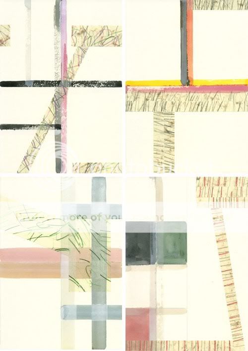
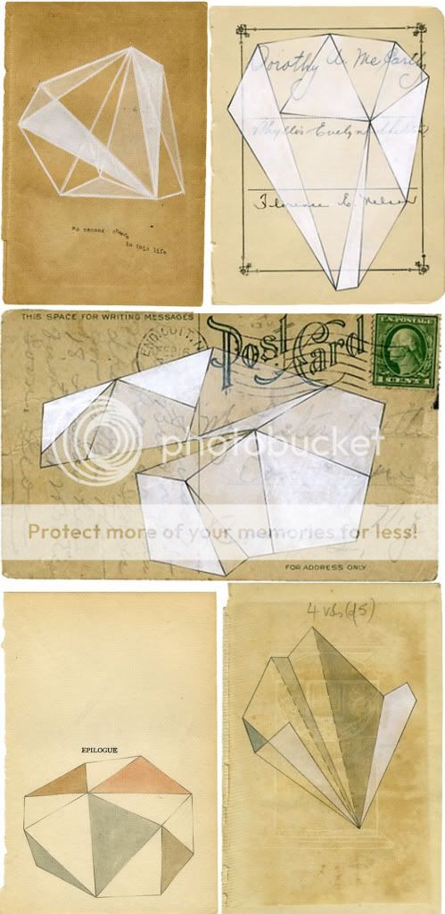
I adore these paintings by Olivia Jeffries. I love the contrast of the sharp geometric forms against the soft texture of the aged paper, and how the original text on the page is incorporated into the composition.

This is how Olivia describes her work on her Etsy profile:

"My creative process is continually influenced by my fascination for used paper; I enthuse about working on a surface that has already been given a sense of purpose in a previous incarnation. Letters, books or journals for example are detached from their original role and are combined with imagery drawn from unexpected perceptions of beauty. Drawing and the use of line is intrinsic to my exploration of the barely tangible traces of life."

Painting with tape

18 Jan 2010


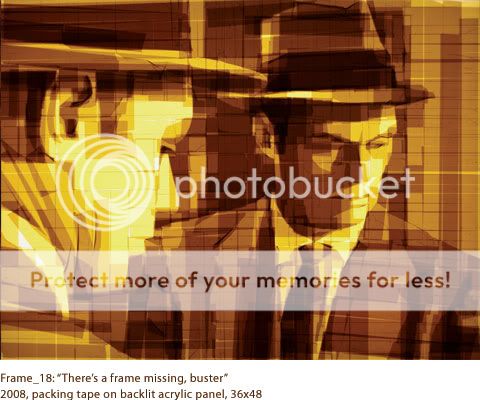
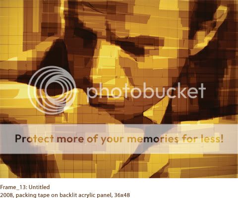
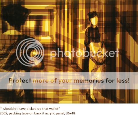
These incredible pictures were created by mixed-media artist Mark Khaisman using brown parcel tape. It's amazing how much depth he's created, and I like the way the angular pieces of tape make a reference to cubism.

This is what he says about his work: "My works are large archetypal representational images, made from layer upon layer of translucent packing tape, applied to clear Plexiglas and placed in front of a light box to give the image shadow and depth. I see my tape art as a form of painting. The 2-inch tape acts as a wide brush, and the light behind the panels as an alchemist's luminous blending medium. In working with tape, like in painting, accident and control are always present.

It takes me usually about a week to make a new work. I feel that work is completed when I no longer understand how it's done, when it feels as if it has a life of it's own."


[Quote & images: Mark Khaisman.]

Door obsession

7 Jan 2010


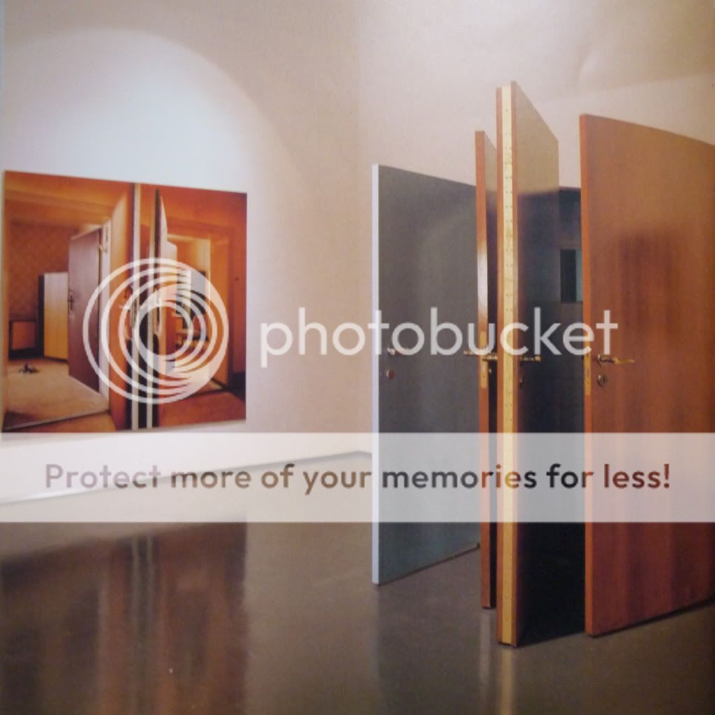
1. Reconstruction of Doors, 1997, Jane and Louise Wilson

2. Double Doors, 1997, Jane and Louise Wilson

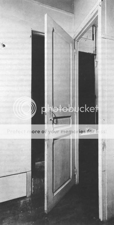
3. Marcel Duchamp's door, 1927

4, 5, 6. Powerless Structures, 2001, Elmgreen & Dragset

Some of these doors make me feel claustraphobic and others are quite intriguing -- especially Marcel Duchamp's door. I like the fact that these images provoke a reaction in me. Although these pieces are installation art, I feel they could be inspiration for a design project too. I actually think they fit in with my project about enticement as doors naturally welcome/invite you into a space. But of course, in the case of Powerless Structures by Elmgreen & Dragset they are the total opposite of what a door should be -- totally useless! I think instinctively we want to open a door as we're intrigued to see what's on the other side, and these doors fight against that curiosity. I also feel that the white doors look very clinical, which conjures up mental images of hospitals making them even less inviting.

How do these doors make you feel?

Essimar's "Pink Mess"

31 Dec 2009


[Images: Essimar]

Recently I've been totally in love with all things Essimar, and I'm especially inspired by her pink paper experiments. I think these images are so poetic and such fun!

Designing in watercolour

4 Dec 2009


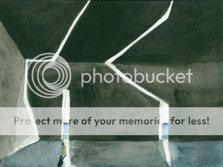
Source: Steven Holl

In my post about the David Chipperfield exhibition I said that I love looking at architects' sketches, and I think Steven Holl's watercolours are my favourite. He has an incredible ability to carve out space with the paint, creating a real depth. I love the intensity of the shadows in contrast to the bright areas of white light. I see an ambiguity in some of the forms, as they could apply to any scale - he may have intended them to represent buildings, but I interpret the forms as walls or furnitutre. Rendered perspectives can often be sterile, especially when created on the computer, but these watercolours have a real atmosphere and feeling about them.

About painting, Steven Holl says, "There is a joy in this way of beginning; it's inspiring and light, and I feel it's in my blood. I open my eyes. It's a new unpredictable day; I have a yearning, and it's unappeasable sometimes."


I'd love this book of his watercolours for Christmas.

Is there a particular architect or designer that inspires you?

Talking to strangers

3 Dec 2009


I went to see the Sophie Calle exhibition at the Whitechapel Art Gallery in London yesterday. I hadn't actually heard of her before but I've since learnt that she is one of France's best known conceptual artsists, and I found the main exhibit entitled "Prenez soin de vous" ("Take care of yourself") to be right up my street!

Premiered at the 2007 Venice Biennale, "Take care of yourself" is named after the last line of an email that an ex-boyfriend sent her. Sophie asked 100 women to read and interpret the meaning of the letter... and the results were hilarious! A translator picked apart the letter, pointing out that it had been written using the polite form of you (vous) which is a rather formal way to address a lover. A musician wrote a piece of music based on the letter, and there was even a parrot chirping away with its "comments". A rifle expert simply shot a hole through the letter! It was quite a moving experience seeing each analysis: I felt sad that their relationship had come to such an abrupt end, and anger at her ex-boyfriend for being so self-centred and arrogant.

The exhibition is very exciting in terms of the way the space is used and the experience that the viewer undergoes. To see the title of each piece the viewer must look up really high, then they need to read, listen and watch. They go on a journey around the space, sit down and look through some photos scattered across a table, then continue walking. One of the gallery rooms showed an interview with Sophie Calle and the interviewer felt that Sophie had really revolutionised the way you look at things. When you read across a wall, you physically go on your own journey along that wall.

Here's a really interesting short documentary about Sophie Calle's work: