Showing posts with label Space of the week. Show all posts

Space of the week: 1950s warm and stylish

2 Mar 2010


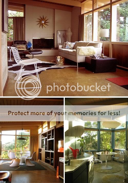
[Image credits: M.Bibelot's flickr stream, found via Here's Lookin at me Kid]

Looking at this recently renovated home is just like taking a step back in time. The spaces are elegant and the timber creates real warmth. My favourite room is the sunny kitchen as the turquoise window frames look so fresh and the outside is really welcomed in through those large windows.

Space of the week: Turquoise love

25 Feb 2010


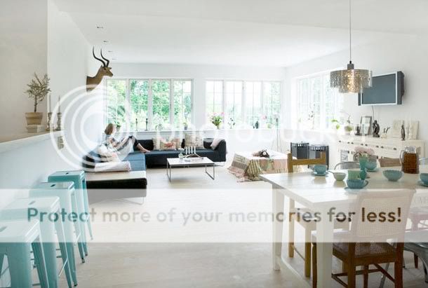
[Photograph by Anitta Behrendt. Found via Decor8]

When I came across this beautiful open plan space I gasped. It's so light and airy and I love the turquoise! I used to adore this colour and wore it almost everyday and had lots of turquoise bits and pieces in my home, but for some reason I fell out of love with it. But I think I'm ready to start introducing it back into my life. It's so fresh and clean, but vibrant at the same time.

The layout of this room is almost the same as my own living space, except mine is narrower and I don't have such wonderful windows. It's spaces like the one above that remind me that I did the right thing painting my home entirely white, but it's the accents of colour that really bring it to life. I wish I'd chosen a darker sofa (mine is boring beige! but maybe I could have slipcovers made one day...) as I love the contrast of the dark against white.

Space of the week: Vintage Treasure

17 Feb 2010


[Image credits: Kay Loves Vintage Flickr and Blog]

I wish I could step into these photos and relax in that lovely blue arm chair, sitting amongst all the vintage goodies. I love the subtle grey-purple wall colour in the first photo; it really brings the room to life and is perfectly balanced by accents of black and pops of colour.

Space of the week: Piou's sweet home

10 Feb 2010


I recently discovered Les petites choses de Piou and totally fell in love with her French home. It's so fresh and happy, and I love that blue sofa! Now I think I want a navy blue sofa.. it's the perfect complement to all the wood.

Space of the week: Arty studio

4 Feb 2010


[Images: deedee9:14. Found via Where People Create]

I love the use of colour in this open plan apartment and studio. The lunch box collection on the shelves serves as Deedee's filing system! I wish I could jump into the photos and explore this fun space.

Space of the week: Multi-task

29 Jan 2010


[Image: Living etc]

I'd happily move straight into this home. I love how they've combined living, dining and office in one space and the red elements pull it all together. The artwork really makes it for me -- so fun how the bottom edges are lined up!

Space of the week: Calming green

19 Jan 2010


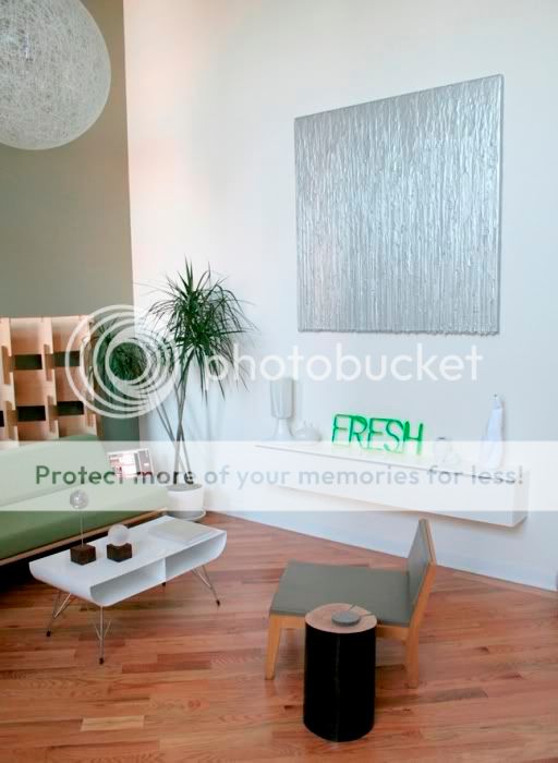
At the moment I'm torn between the very clean and calm style of this home, and something with more vibrant colours. This is a space that I often refer to as I've tried to create a similar calm environment in my own home, but I'm still deciding whether I should introduce some more colour. Here, the soft green acts as a wonderful backdrop to their stunning furniture and sculptures. I think it works so well because the high ceilings and diagonal wood flooring add drama.

Space of the week: Mid-century modern

12 Jan 2010


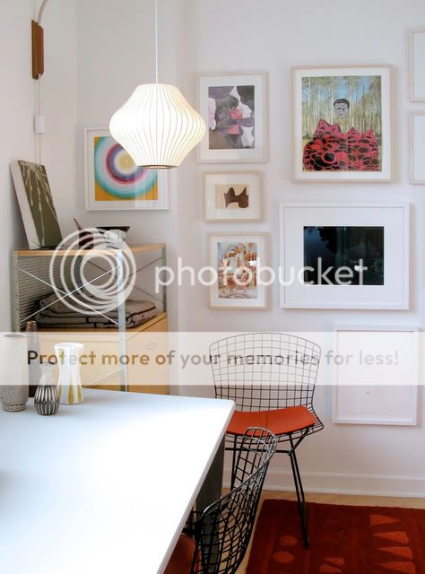
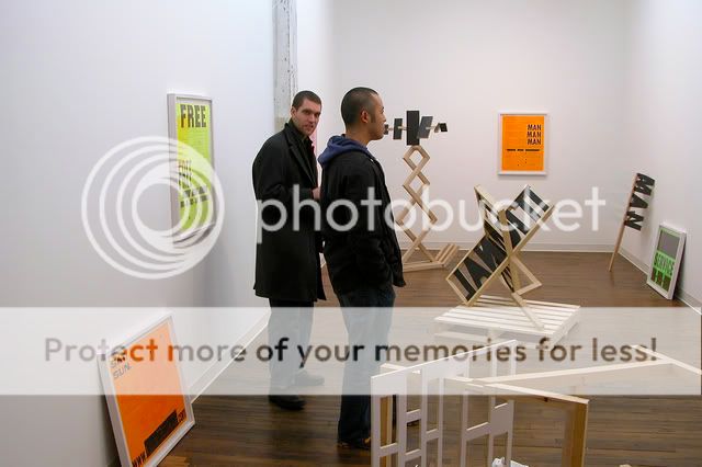
I squealed with excitement when I saw this home on Apartment Therapy last week. I LOVE it.. especially the white walls with the pops of colour, the shapes of the furniture, the way the artwork is arranged on the walls, and all those windows. I definitely need some more colour in my home!


Isn't it fun how he's incorporated a gallery into his home?


[Images: Apartment Therapy, Home of Dan Devening, Chicago]

Space of the week: A touch of red

4 Jan 2010


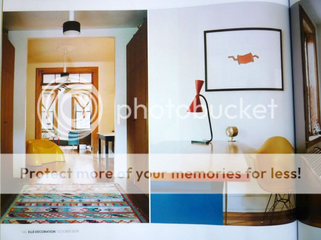
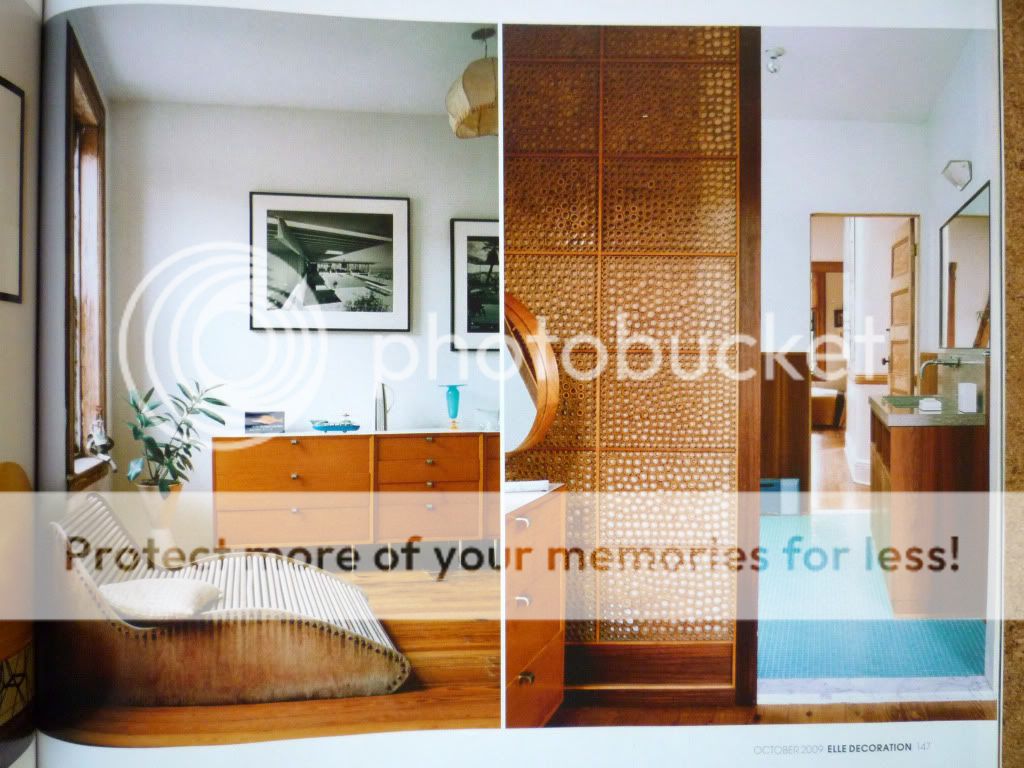
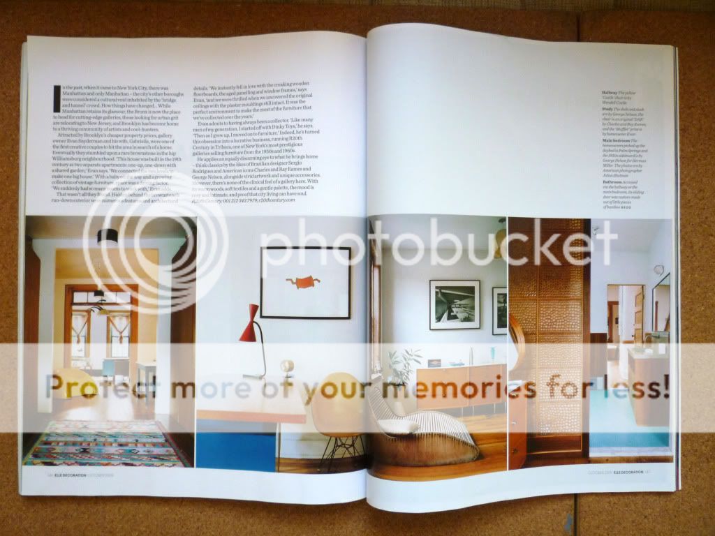
[Click to enlarge. All images: Elle Decoration October 2009.]

This stunning house is owned by Evan and Gabrielle Snyderman of
r20thcentury. I love the accents of red contrasted with the pure white backdrop of the walls. I'm definitely going to try and introduce some more red into my own home in 2010 (and my wardrobe!). I love the simplicity of the design, but it's not bland in the slightest, and that's due to the bursts of colour, as well as the interesting furniture and curiosities that they have collected over the years.


Space of the week #3 Puzzle Loft

29 Dec 2009


[All images: Dwell]

This New York loft apartment is truly a puzzle, both in the way architect Kyu Sung Woo solved the spatial problem of stacking two 7 foot tall rooms with only 12 feet of vertical space, and his clever solution where two volumes are interlocked, each with a half height element. The bedroom borrows height from the cupboard below and the kitchen borrows height from the space where the bed is.

The incredible attention to detail has actually made this into a beautiful little apartment: look at how the bedroom area has been lined with wood. Given the right circumstances I think this would make the perfect home for someone. I am completely obsessed with interlocking forms.. I just find this kind of design so appealing and I'd love to design something like this one day :)

Space of the week #2

22 Dec 2009


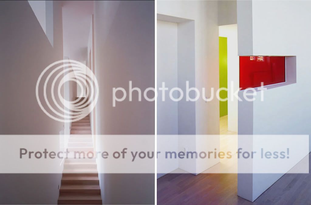
[Interior images & sketch model: Claesson Koivisto Rune]

I love pretty much everything designed by Claesson Koivisto Rune, ranging from their furniture and interiors, to entire buildings. I think the bold shapes they use work really well because the pallet of materials is kept so simple, with a few bursts of intense colour. This project is actually a design office in Sweden, but I can imagine it being any kind of space. I really like the glimpses created by the slots; there would be so many exciting views through the building. I love spaces that slowly reveal themselves and entice you to explore further. And wouldn't those bursts of colour be a refreshing surprise in such a white space?

Space of the week #1

17 Dec 2009


Designer: Luca Andrisani. Images via: Apartment Therapy & Luca Andrisani

I first saw these photos in Apartment Therapy's Small Cool 2008 contest. I added the page to my favourites and I pop back from time to time as it's a look that I just adore and find very inspiring. To me, the design is just perfect: the clean lines of the timber contrasted against a crisp white backdrop. It's striking yet unfussy.

I've decided to start a Space of the week feature so I can keep track of my tastes and see how they develop over time. I've chosen the notion of Space as opposed to Room of the week as I feel this title covers everything from interiors to buildings. I often find it tricky to articulate the reason why I like something. I instinctively know what I like, but I'd like to get better at expressing the reasons behind my choice.

Do you think it's always possible to pinpoint exactly why you like something, or do you sometimes just get a gut feeling?