Etsy Favourite: Ninainvorm

28 Feb 2010


[Image credits: Ninainvorm's etsy shop and blog]

I came across Nina's blog a few weeks ago, and then last week she was on the Etsy front page as a featured seller which reminded me of her fresh and wonderfully light-hearted creations. As well as making colourful collages, she screen prints her designs onto vintage tablewear: the triangle-print jug and sugar bowl are my favourite items in her shop. She has the most beautiful craft area... I especially love the yellow and blue lamps.

Wood & Wool Stools

27 Feb 2010

[Image credits: Wood & Wool Stool flickr]

I love these recycled stools with crocheted covers by Ingrid Jansen. The image on the left shows a wedding stool that she's recently completed. Isn't that such a lovely wedding present? And such a great craft nook under the stairs!

Vegan Shoes round-up

26 Feb 2010


I'm always on the lookout for great vegan shoes. I don't wear leather as wearing a dead animal on my feet repulses me just as much as the thought of eating one. I have a bit of a dilemma as well-fitting, pretty and affordable vegan shoes are not easy to find in England, as I mentioned here before. As much as I enjoy studying Interior & Spatial Design, why, oh why didn't I choose to study fashion design and specialise in footwear?! There is such a gap in the market for reasonably priced, attractive vegan footwear! Mark my words: this niche will take off in the next few years.

Anyway, this is a round-up of some of my favourite non-leather shoes. Most are out of my budget, but they're pretty. I've convinced myself that I need the navy Crocs slip-ons for the spring. Crocs = walking on air, and these ones are cute, right?

1 Cri de Coeur "Kate" sandals, £42.50 (originally £95)
2 Beyond Skin "Gloria" heels, £112 (originally £160)
3 Green Shoes "Willow" shoe, £106
4 Green Shoes "Lovage" sandal, £60
5 Crocs "Lady" slip on, £24.95
6 Beyond Skin "Sole", exclusively for Anthropologie, £35 (originally £65)

Space of the week: Turquoise love

25 Feb 2010


[Photograph by Anitta Behrendt. Found via Decor8]

When I came across this beautiful open plan space I gasped. It's so light and airy and I love the turquoise! I used to adore this colour and wore it almost everyday and had lots of turquoise bits and pieces in my home, but for some reason I fell out of love with it. But I think I'm ready to start introducing it back into my life. It's so fresh and clean, but vibrant at the same time.

The layout of this room is almost the same as my own living space, except mine is narrower and I don't have such wonderful windows. It's spaces like the one above that remind me that I did the right thing painting my home entirely white, but it's the accents of colour that really bring it to life. I wish I'd chosen a darker sofa (mine is boring beige! but maybe I could have slipcovers made one day...) as I love the contrast of the dark against white.

Light-filled attics

24 Feb 2010


One day I'd love an attic retreat like these two ... atelierpompadour, laurensh.

Ferdinand Penker

23 Feb 2010


[Source: Galerie Schuette]

A couple of weeks ago I attended a lecture by minimalist Austrian artist, Ferdinand Penker. His work is inspired by his vast collection of cheese graters; they are almost identical but each one has slight variations. The notions of series and repetition are central to his paintings. He creates paintings in which he repeats the same colour over and over again, where there are only small variations in the texture of the brush strokes. These are displayed in rooms where every available piece of wall is covered in nearly identical paintings.

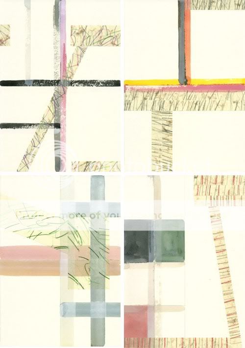
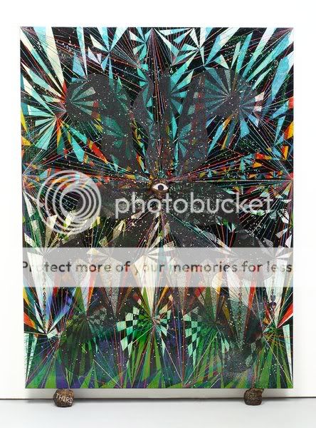
Although I do like his paintings and other creations, I was particularly drawn to the ones above which are a collaboration between Ferdinand Penker and Trevor Sutton. The pencil markings on masking tape are the cast offs from Penker's own drawings (the tape is used to stick drawing paper to his desk, and when his pencil veers off the page the masking tape is marked), and it has been layered over a geometric painting by Sutton. I'm not the best art critic, but I do like the way the lines, colours and textures intersect.

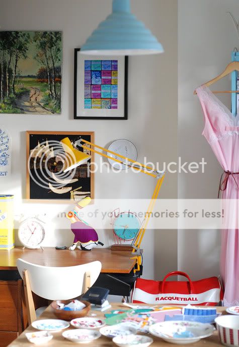
One thing that Penker said that I will try to remember, is that drawing can help you achieve a real sense of concentration, and it's important to just draw for the sake of drawing.

Simple & slightly retro

20 Feb 2010


[Image credits: Desire to Inspire]

I think this is one of the most beautiful homes I've ever seen and I might be in love... It's simple but not boring; colourful yet calm; full of interesting pieces but not cluttered. Just the perfect balance of everything. I especially like the aqua and yellow bathroom!

Once again, I find myself craving more colour for my home!

Snug

19 Feb 2010


[Image credits: Snug blog and shop. Found via Here Comes the Sun]

When I saw these photos yesterday, I thought to myself, "Why didn't I think of that before?!". Aren't those the best placemats ever? I rarely find practical ones that I like, but these certainly fit the bill. I adore the cut-out tree. I can imagine it at various scales: small for hanging necklaces.. and as a really big minimalist Christmas tree! I wish a had a saw as I'd love to make some of these trees and paint them fun colours... Hmm.. maybe I could use the workshop at university.......

Miss Print

18 Feb 2010


[Miss Print, found via Elle Decoration - March 2010 issue]

These stunning wallpapers and wall vinyls are handprinted by Rebecca and Yvonne Drury in their East London studio. I would love to find an special place to incorporate one of these fun patterns into my home. Their website is a feast for the eyes, and also offers cushions, lampshades and vintage furniture.

Space of the week: Vintage Treasure

17 Feb 2010


[Image credits: Kay Loves Vintage Flickr and Blog]

I wish I could step into these photos and relax in that lovely blue arm chair, sitting amongst all the vintage goodies. I love the subtle grey-purple wall colour in the first photo; it really brings the room to life and is perfectly balanced by accents of black and pops of colour.

Favourite dresses

16 Feb 2010


1sr row L-R: Wikstenmade, Marie Emily, Darling Dexter
2nd row L-R: Postlapsaria, Green Olives Design, Green Olives Design

These dresses are all handmade by the lovely girls modelling them. There's something magical about creating a garment from scratch; specifically to your measurements. This is a skill that I would love to learn one day. I don't have a sewing machine so the most I can do is cut of the bottoms of dresses and skirts (sometimes I get a bit too scissor-happy) and dye clothes new colours. But I dream of making the perfectly fitting dress in a rainbow of colours. These dresses are such eye-candy for me.

Yellow kitchens

15 Feb 2010


[Image credits: 1 & 2 Real Living via Morning Light & The Design Files, 3 Living etc, 4 Hooked on Houses.]

It must feel like summer all year round in these bright and sunny yellow kitchens. I especially love the mis-matched 1950s cupboards in the last image. Why are kitchens so serious these days? If only my cupboards were wood then I'd whip out some yellow paint and brighten up the doors...

Triangulation

12 Feb 2010


I was unaware that I'd become so obsessed with triangles until I had a look through my recent flickr fav's! Aren't these images fun?! They make me feel really happy - especially the 4th :)

Yesterday I received a sweet comment from City Girl Chicago to say that she's learning more about my tastes and as soon as she saw the images in the last post, immediately knew it was my style. It's so funny because before I started this blog I only vaguely knew what I liked - I just couldn't pin it down. One of the things that I'm enjoying most about blogging is seeing how my tastes develop over time. It gives me the opportunity to take a step back and analyse the things that visually stimulate me. I've definitely become more confident with colour. A couple of years ago I always gravitated towards green (I still have far too much of it in my home, but at least it feels leafy and fresh..!) but now I'm drawn towards yellow, red, purple, orange...

Has anyone else had the same experience since starting their blog? Do share!

Castle and Things

11 Feb 2010


I neeeeeed some of this bedlinen and artwork by Castle to brighten up my home ready for the spring! Isn't it pretty? I'm really in love with the splashes of sunny yellow.

Space of the week: Piou's sweet home

10 Feb 2010


I recently discovered Les petites choses de Piou and totally fell in love with her French home. It's so fresh and happy, and I love that blue sofa! Now I think I want a navy blue sofa.. it's the perfect complement to all the wood.

Room 606, Royal Hotel Copenhagen

9 Feb 2010


[Image credits: Flickr pool, Ultraswank, Smow]

Room 606 is the only hotel room with the original Arne Jacobsen décor from July 1960 when Royal Hotel Copenhagen first opened. It still functions as a normal hotel room: can you imagine waking up there one morning?! The blues and greens are so refreshing. I like the way the pictures have been hung in the simple frames and I can just imagine Arne calculating the perfect position. To me, this room is perfection.

My latest obsession...

8 Feb 2010


...Graphic Textiles

Habitat double duvet £55
Habitat table runner £18
Heal's double duvet set £115
Urban Outfitters rug $34

There's something so fresh and playful about these textiles. I really need that rug.. but I should be thankful that they don't stock a home range in Urban Outfitters in England, as I'm sure I'd spend dangerous amounts of time and money in there!

Dream Dining Room

7 Feb 2010


[Image source: Living etc]

I love the bold colours in this space and the way the paintings are casually propped up against the wall. It's so relaxed yet elegant!

PS. Some sweet person nominated me on the Lovelies. If you happen to be over there, feel free to leave a message to vote for me - or vote for whoever you'd like, of course! ;)

Carving my initials

6 Feb 2010


[Images: Prints of original artwork by Carving my Initials available on Etsy]

Aren't these pictures enchanting? Some of the markings look ambiguous and make me wonder if they were intended to be part of the picture when the artist started the piece, or are they test sketches that were used to decide on the final composition? I love the gradient of soft colours in the last picture layered over the pencil.

Chris Ofili at Tate Britain

5 Feb 2010


I saw the Chris Ofili exhibition at Tate Britain on Wednesday. I didn't know anything about this artist, so when I entered the first room and noticed elephant dung on his paintings I was slightly shocked! But I was immediately blown away by the stunning colours. When you go up close, you can see layer upon layer of dots in vibrant colours. Close up shot of texture:


I've since learnt that Chris Ofili started using elephant dung in his paintings when he was in Zimbabwe. He says, "[Using dungballs is] a way of raising the paintings up from the ground and giving them a feeling that they've come from the earth rather than simply being hung on a wall." [Quote from exhibition leaflet]. When I read this, it made much more sense to me.


It's a large exhibition with 7 rooms in total and my favourite was the Upper Room which takes you on an extraordinary sensory experience. The paintings are displayed in a specially constructed vault designed in collaboration with architect David Adjaye.

To enter the vault you first pass through a long corridor which is completely dark apart from some illuminated openings along the floor. It's quite scary walking in the dark but the lights entice you further into the space.


When I reached the end of the corridor and turned the corner, I was amazed that the entire space was clad in beautiful timber - floor, walls and ceiling. The texture was lovely, as it felt smooth but also quite raw.


The lighting is exquisite. Each painting is illuminated by a single directional light from above, and it is this light that shines through the openings behind the paintings into the corridor. The paintings literally glow against the dark timber backdrop, and the light is reflected in a pool at the foot of each canvas. The conditions in the timber vault really bring out the richness of the paintings.


I feel I really learnt something at this exhibition, and not only about a new artist, but also about the design of the exhibition. I should visit Tate Britain more often as it is directly opposite my college and I have free access as a student!

[Image sources: 1, 2, 3, 4, 5, 6, 7]

Space of the week: Arty studio

4 Feb 2010


[Images: deedee9:14. Found via Where People Create]

I love the use of colour in this open plan apartment and studio. The lunch box collection on the shelves serves as Deedee's filing system! I wish I could jump into the photos and explore this fun space.

Dandelion clocks

3 Feb 2010


[Images: Sanderson. Available from John Lewis]

This new line of fabric and wallpaper by Sanderson is so pretty. It's a company that I would normally associate with more traditional designs, so it was such a surprise to see this fun Lucienne Day inspired dandelion print. I'd really like one of those cushions for my bed...

Comfortable and fresh

2 Feb 2010


[Images: Lillian Day on Flickr, originally found on Apartment Therapy]

Lillian's Vienna home is filled with beautiful light and comfortable spaces that welcome you in. I love the warm wood with the cool tone walls and sofa - so refreshing!